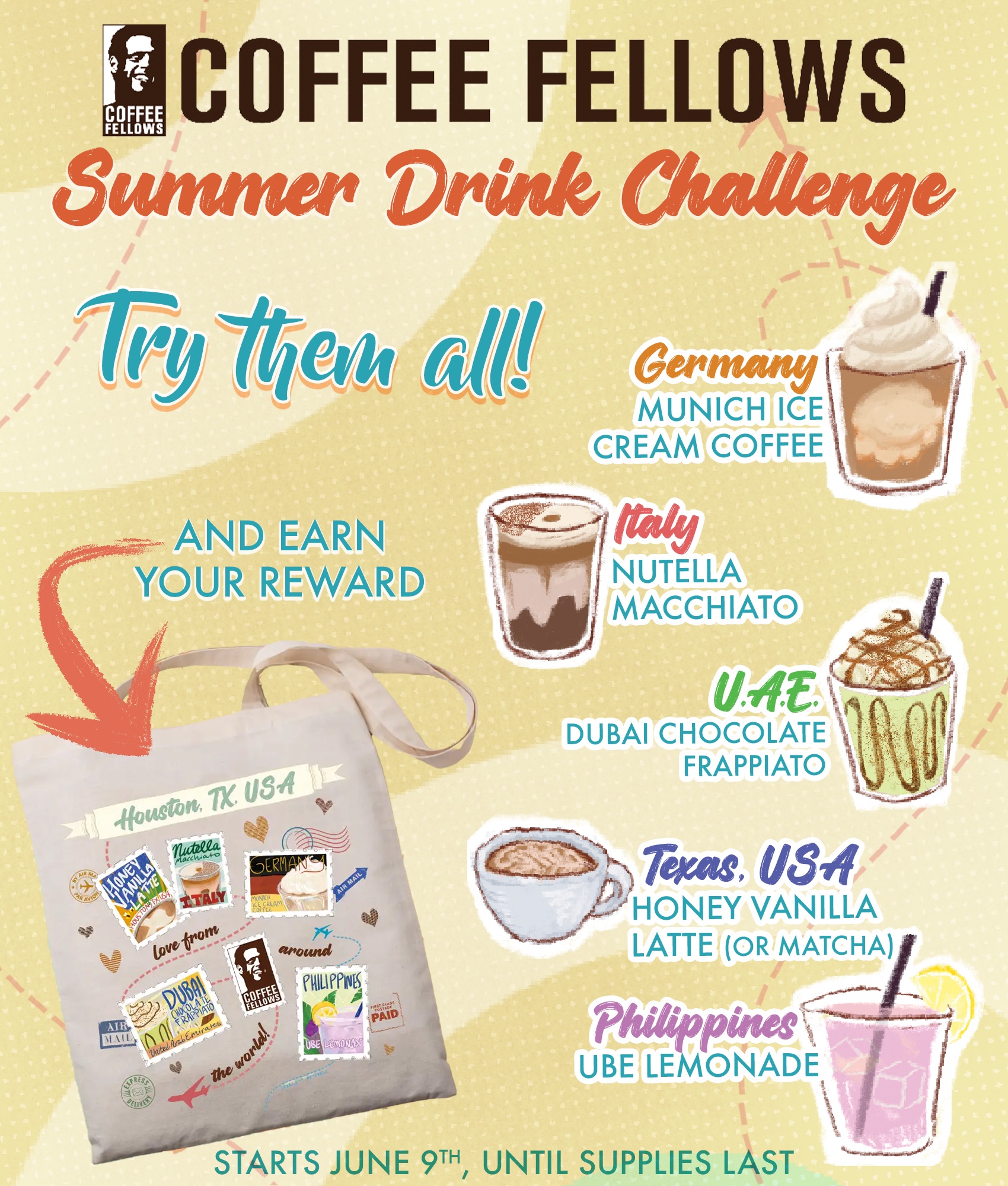
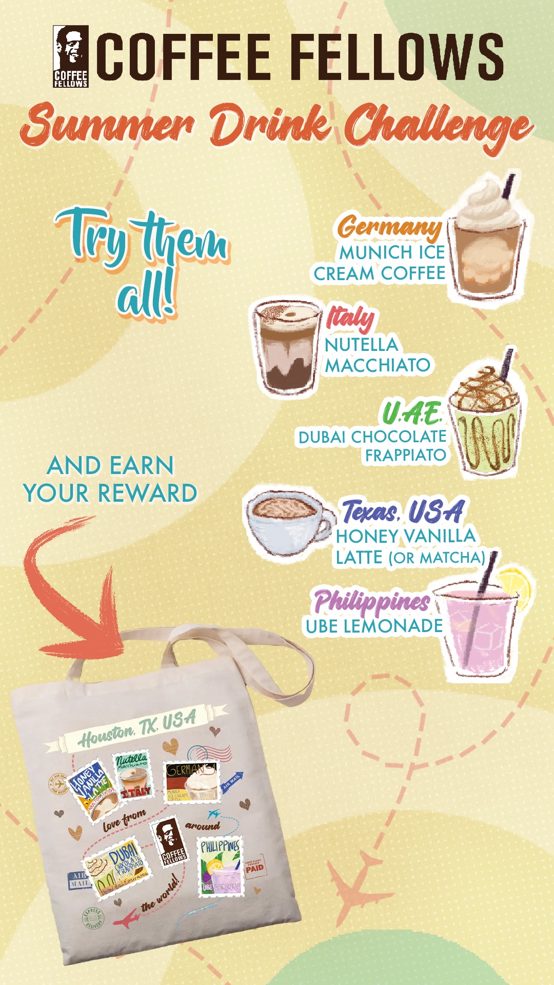
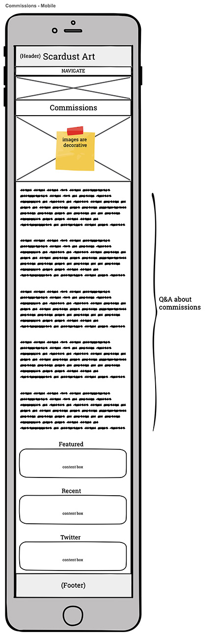
Coffee Fellows North America wanted to do a punch card and giveaway to promote their summer drinks. Using multiple hand-drawn illustrations for the project, a double-sided totebag, an animated map, a punch card, and a cup design were created for the promotion. The tote bag was a prize for completing the punch card. Marketing graphics with mockups were also created to promote this campaign.
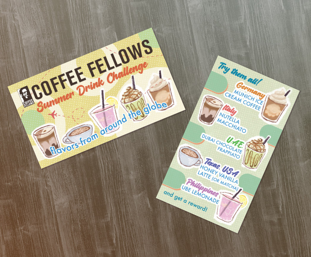
Punch Card
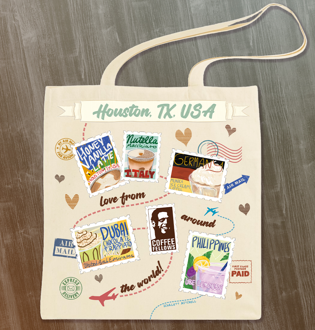
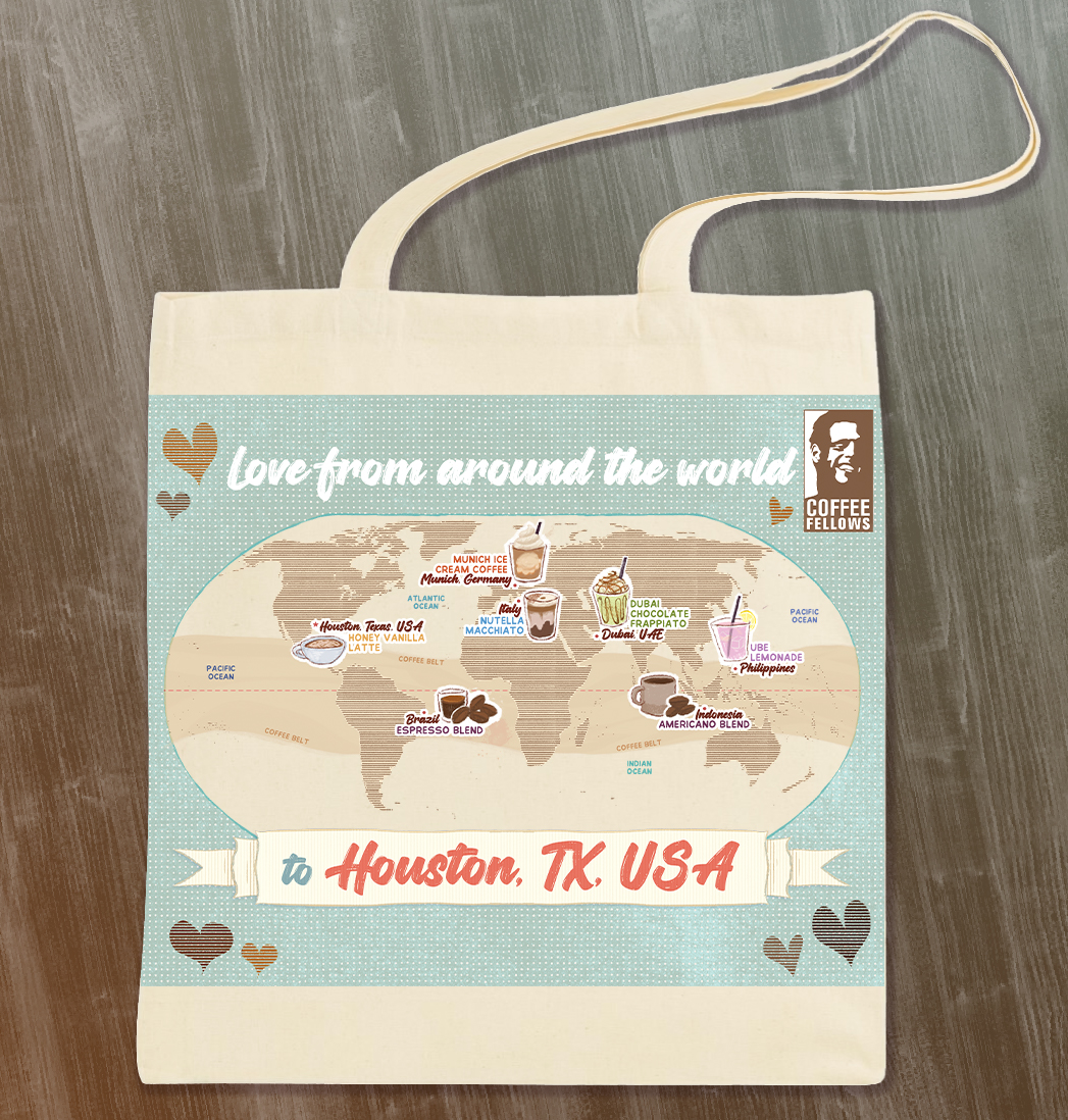
Totebag Design
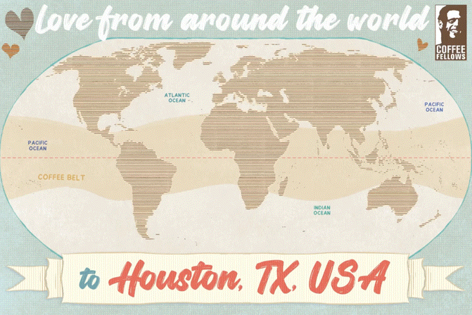
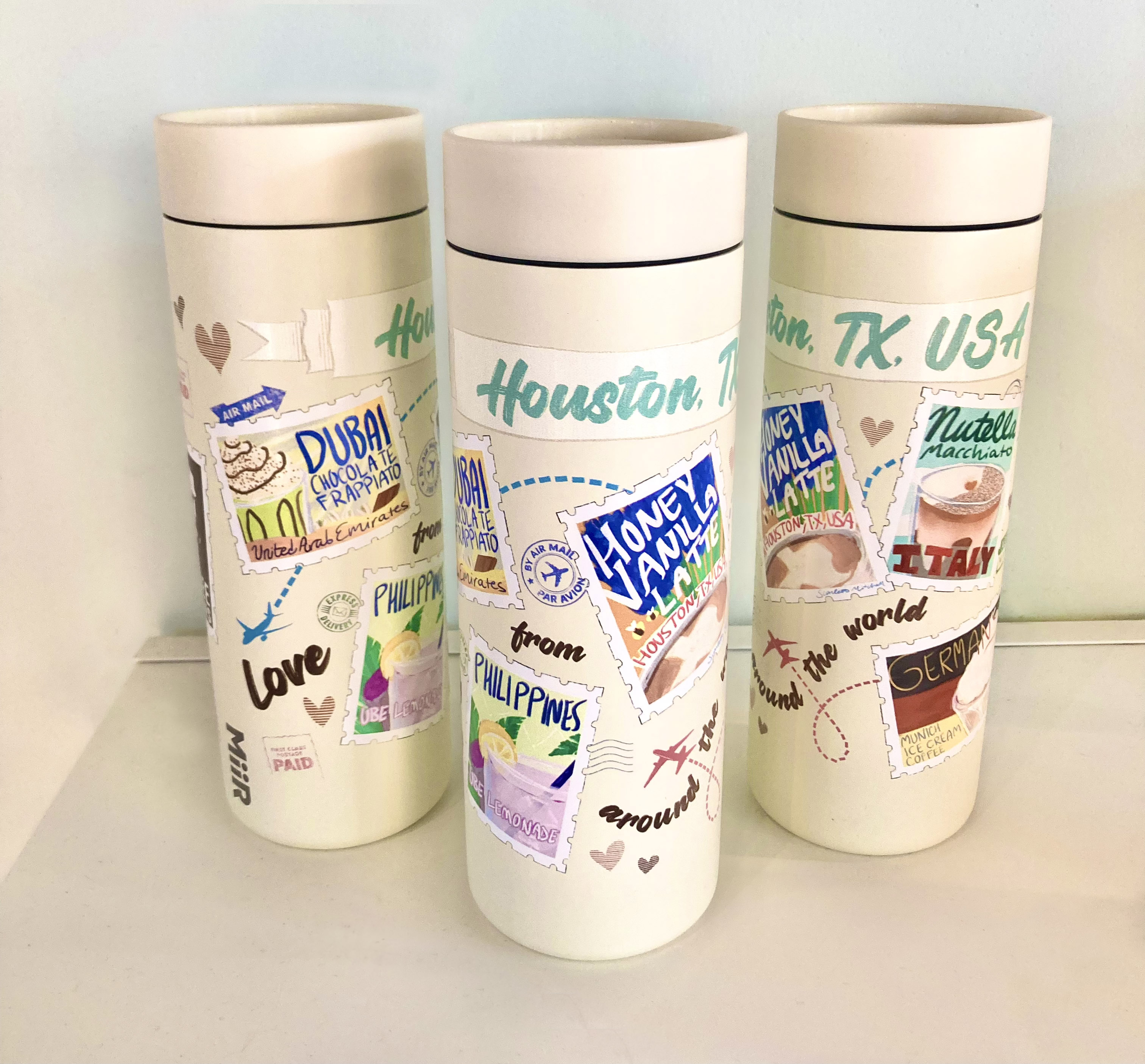
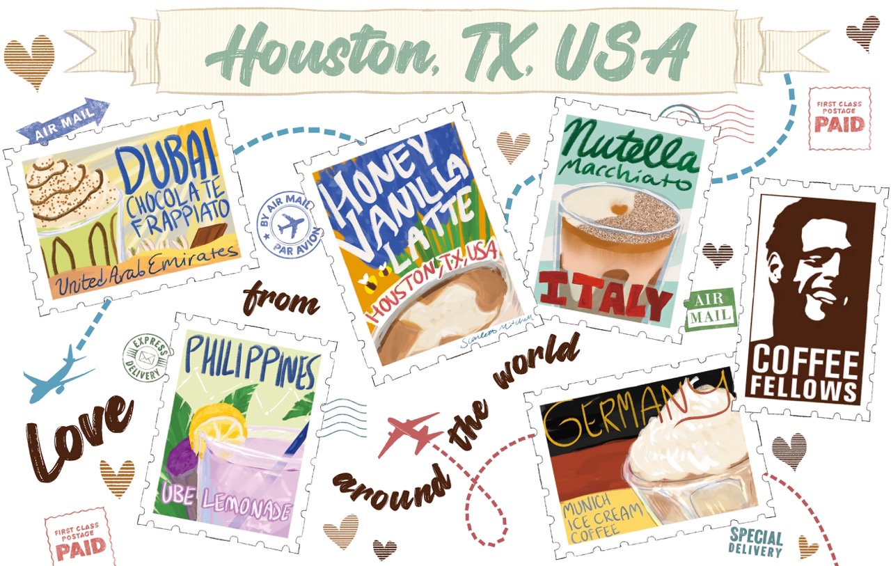
Stamps Design with 5 Drink IllustrationsMap Design
Travel Cup Design
Stamps Design with 5 Drink Illustrations
Promotional Graphics
Graphic for Website/EmailGraphic for in-store Menu ScreenSummer Drinks Campaign
motion
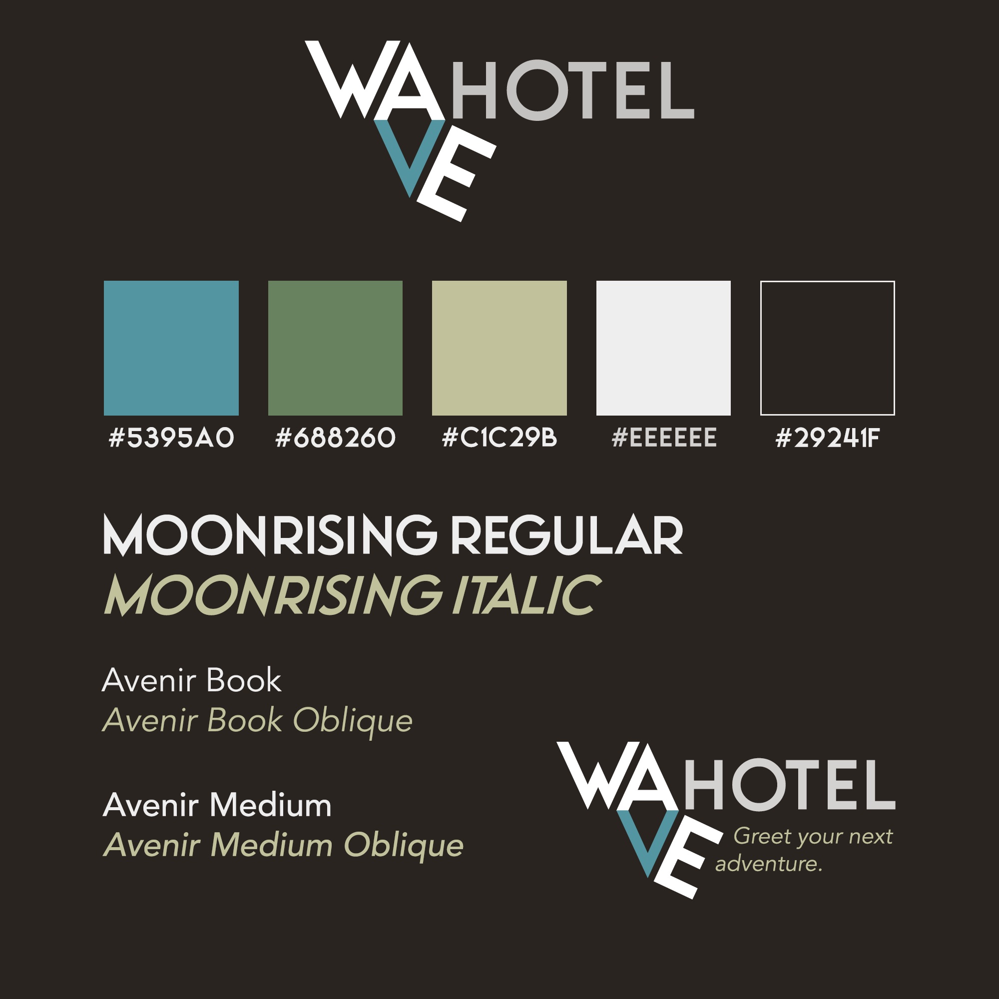
Wave Hotel
Hotel Branding & Merch Design
branding // logo // print // product design
A hotel needed new branding to kickstart awareness and improve the company’s image. Wave
Hotel wanted merchandise as well that would leave a lasting impression. The logo was created,
along with typography and a color scheme. Using these new brand standards, business cards
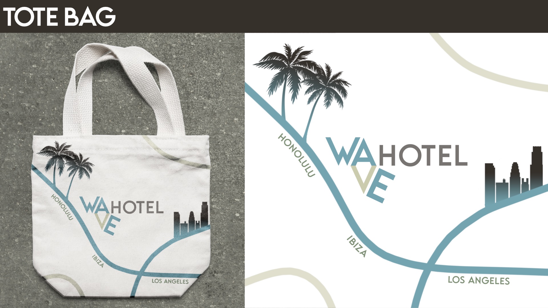
and a tote bag were also designed.
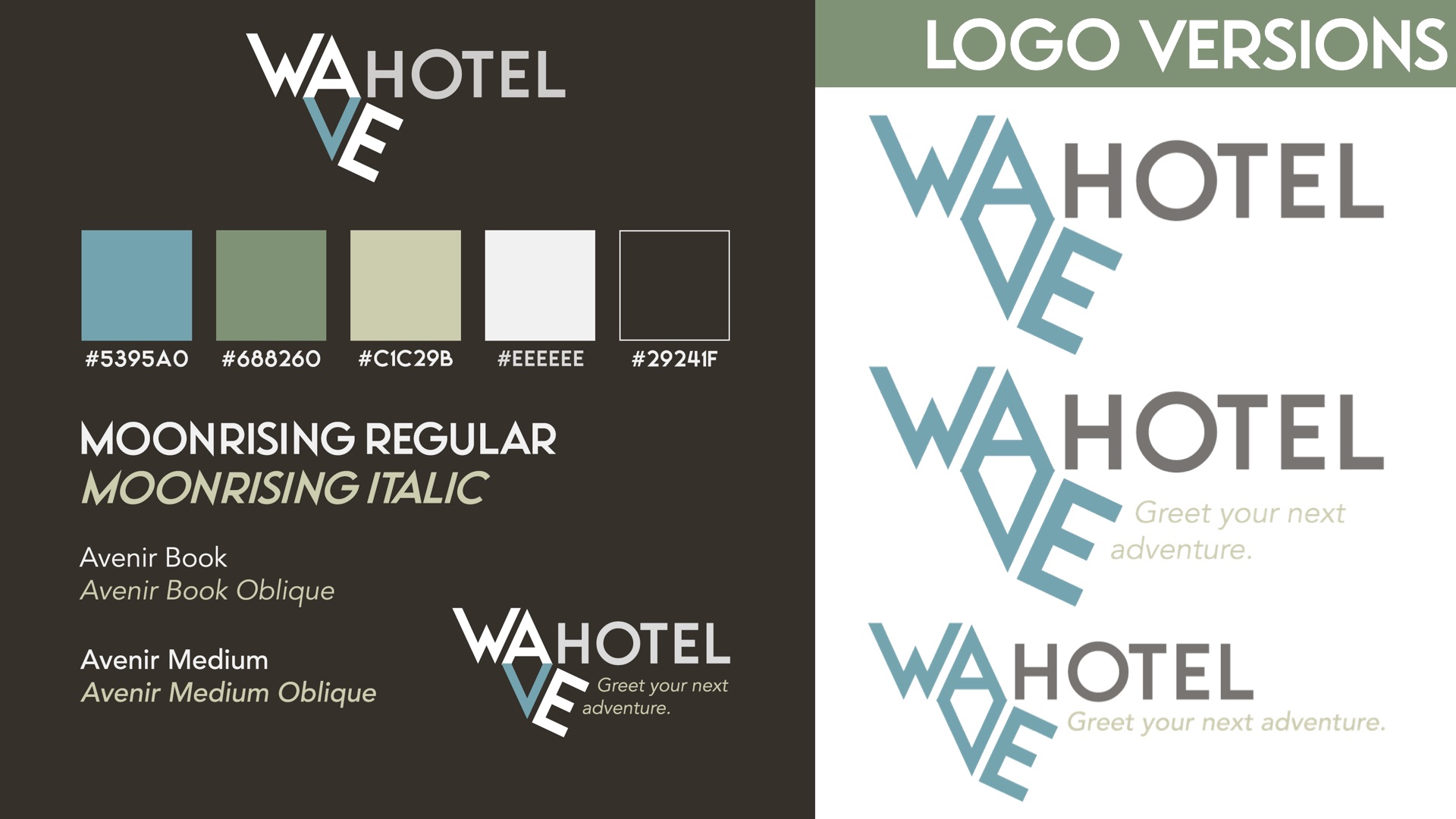
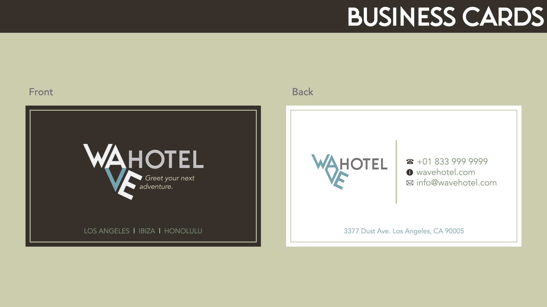
Designs
Logo, Colors, TypographyBusiness CardTote Bag
Hotel Branding
Created for demo/educational purposes only. Wave Hotel is a fictional brand.
Tools used: Adobe Photoshop, Procreate
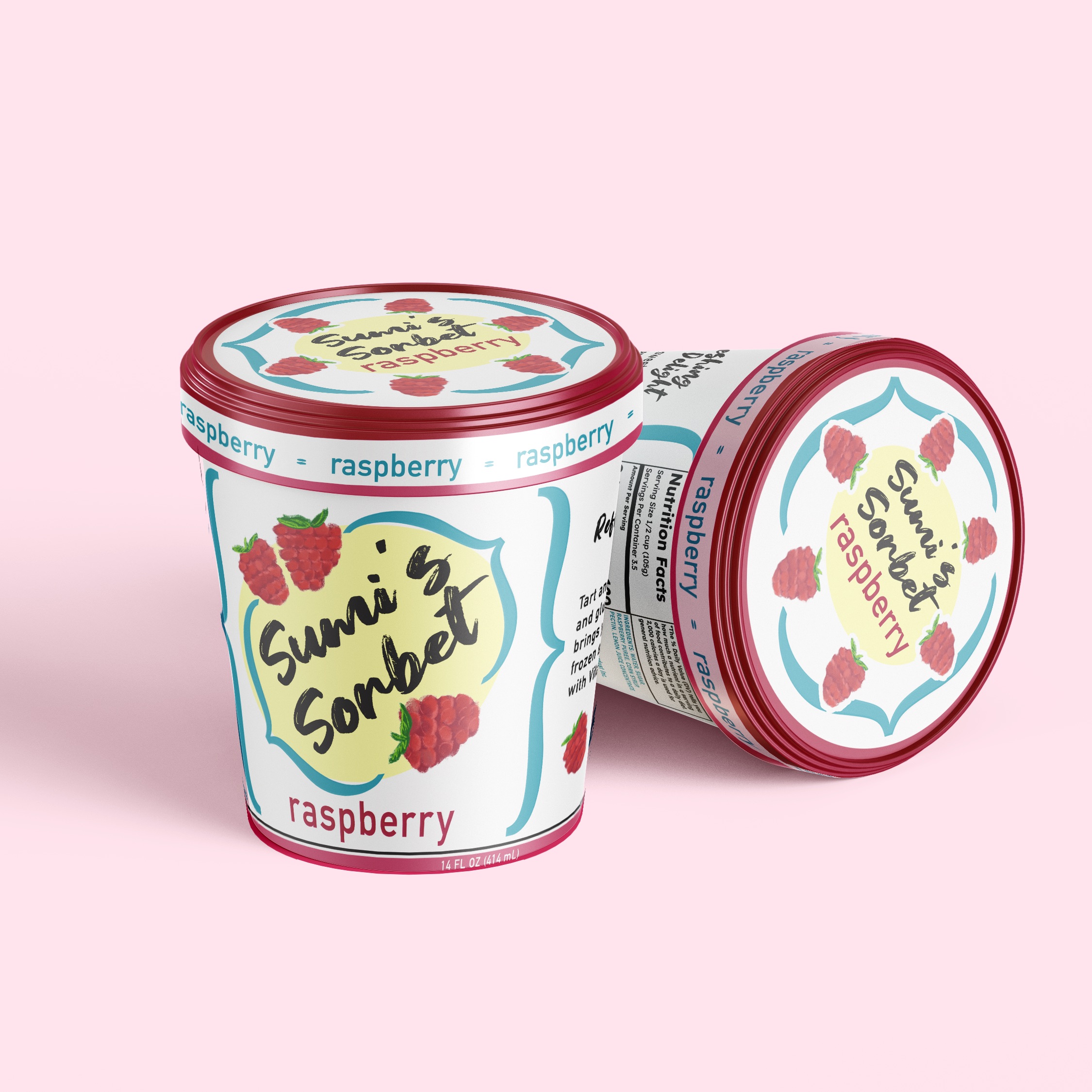
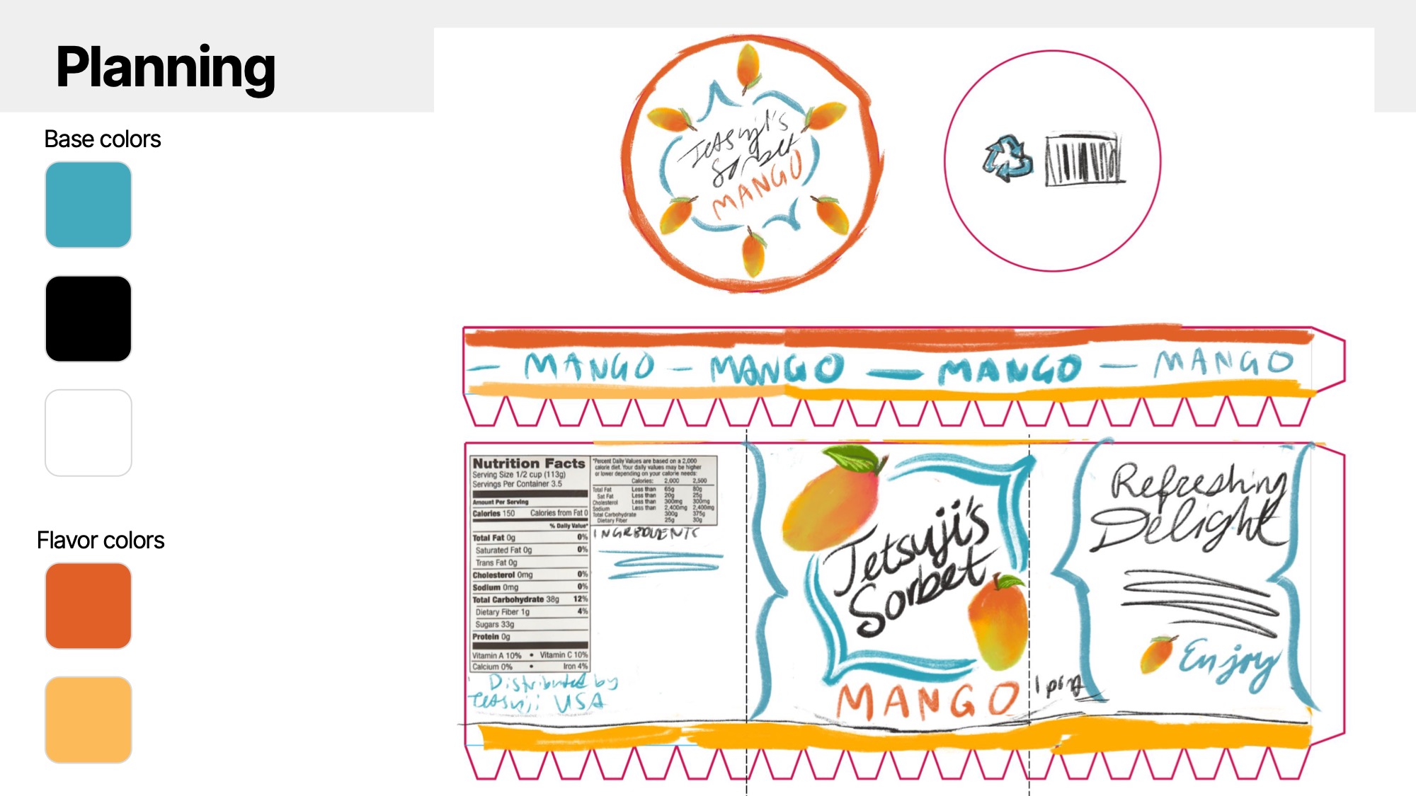
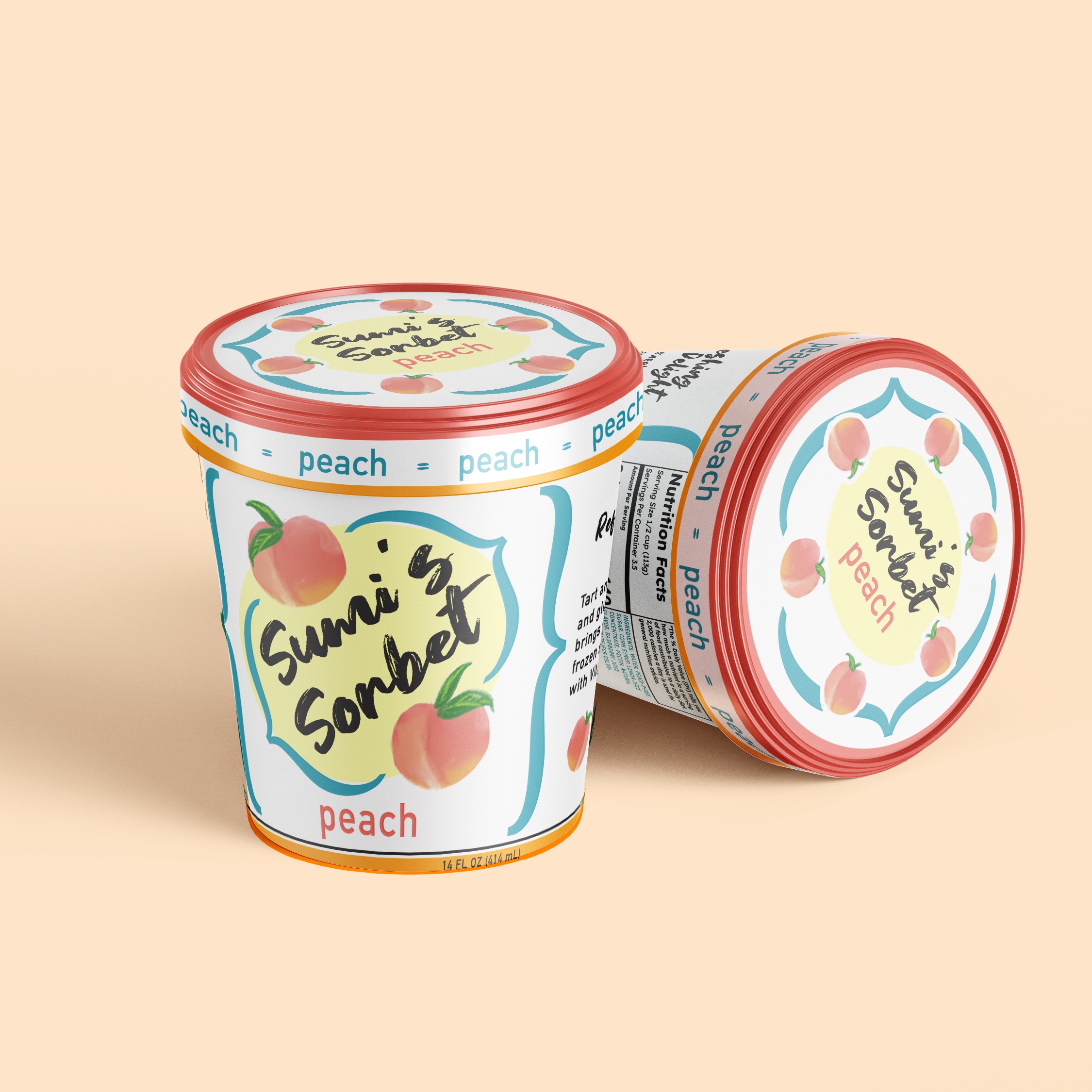
Sumi's Sorbet needed fresh new product design. Mockups and print designs were created with
a refreshing, colorful aesthetic for the different sorbet flavors, including fruit hand-drawn by the
designer.
Sketches
Flat Designs
Peach FlavorRaspberry FlavorMango Flavor
Mockups
Peach FlavorRaspberry FlavorMango Flavor
Sorbet Container
Created for demo/educational purposes only. Sumi's Sorbet is a fictional brand.
Tools used: Adobe Photoshop, Procreate
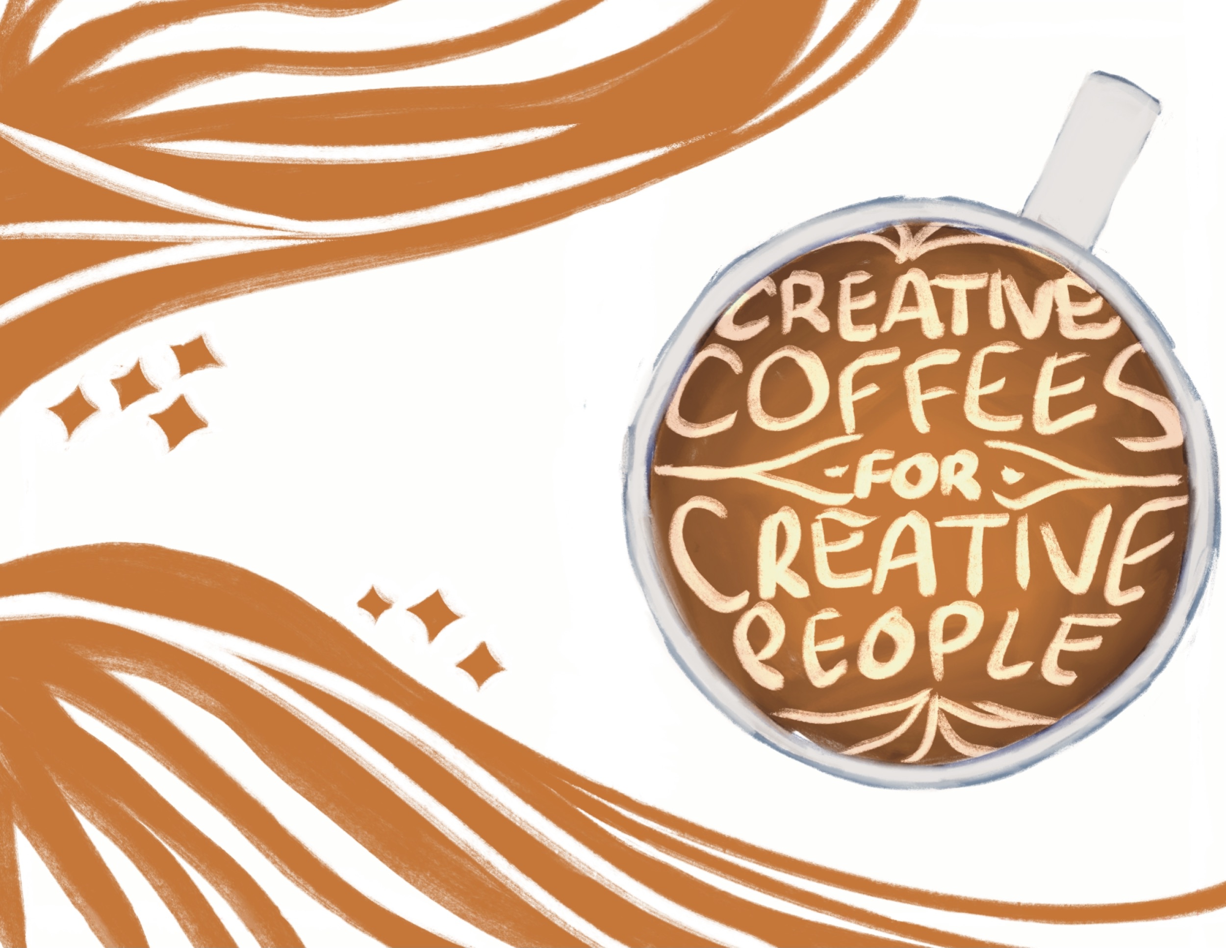
Creative Coffees
Zine Creation
Print // Publishing // Zine
// Illustration
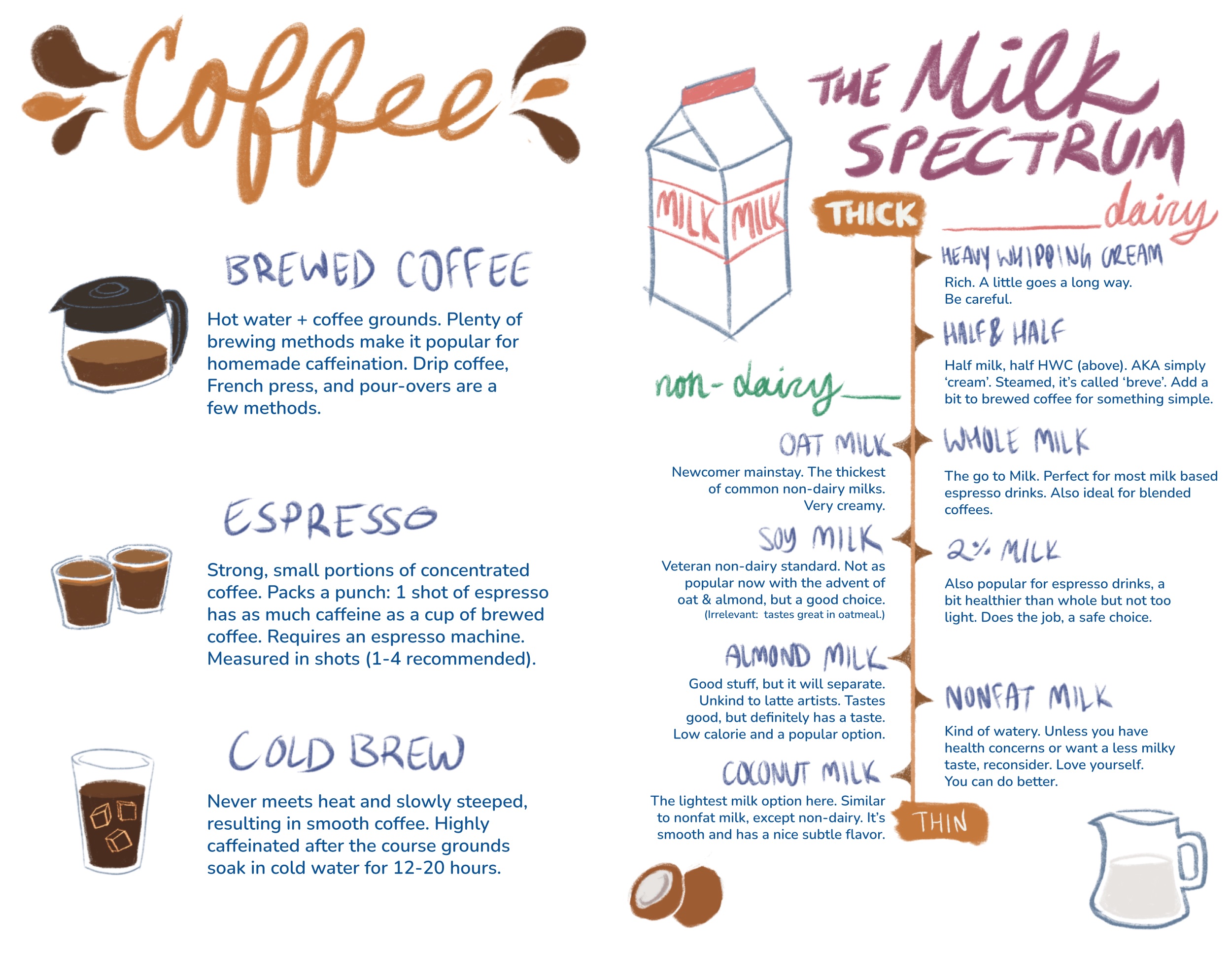
Creative Coffees for Creative People is a coffee-themed zine that was created with the intention of
educating people about coffee and
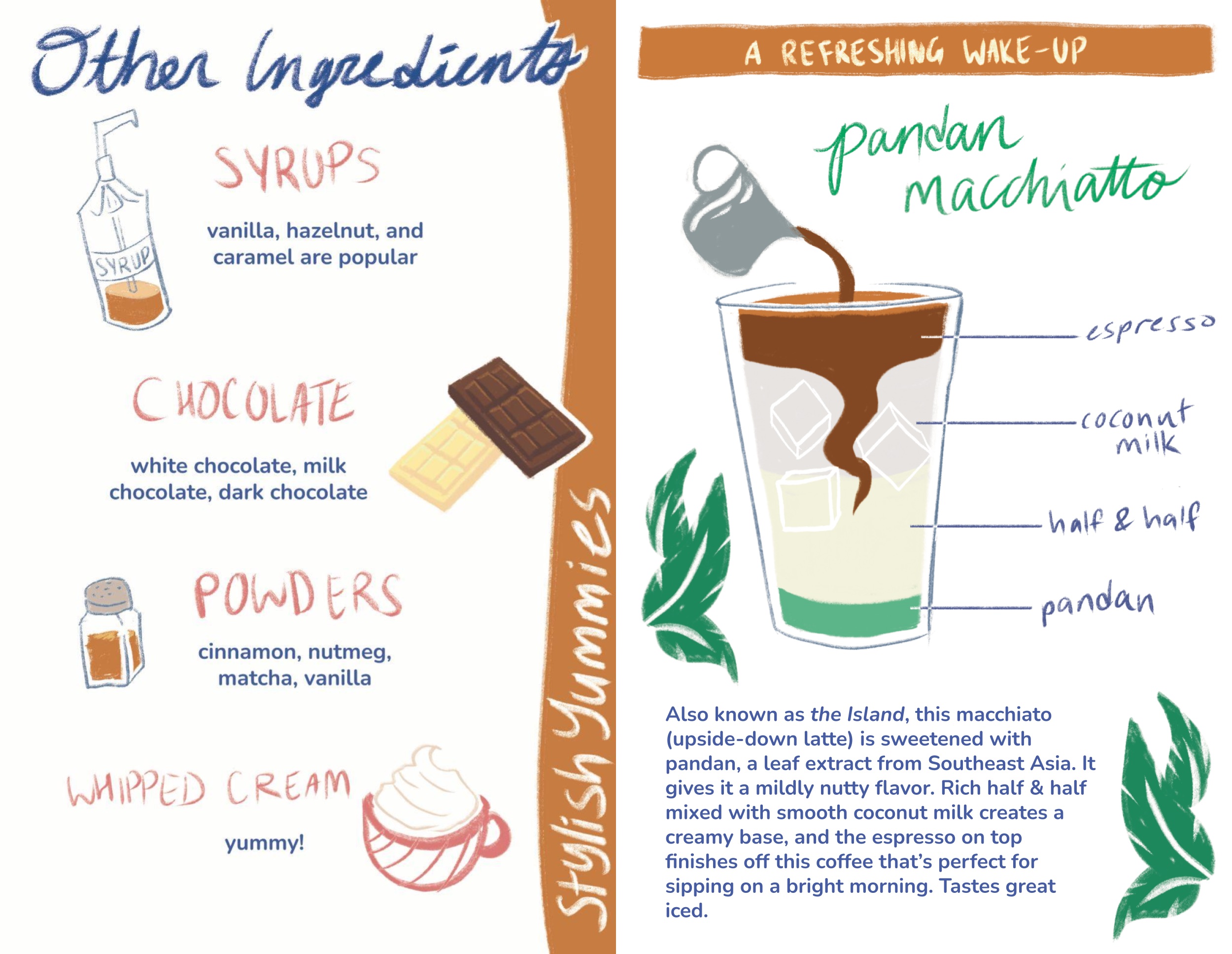
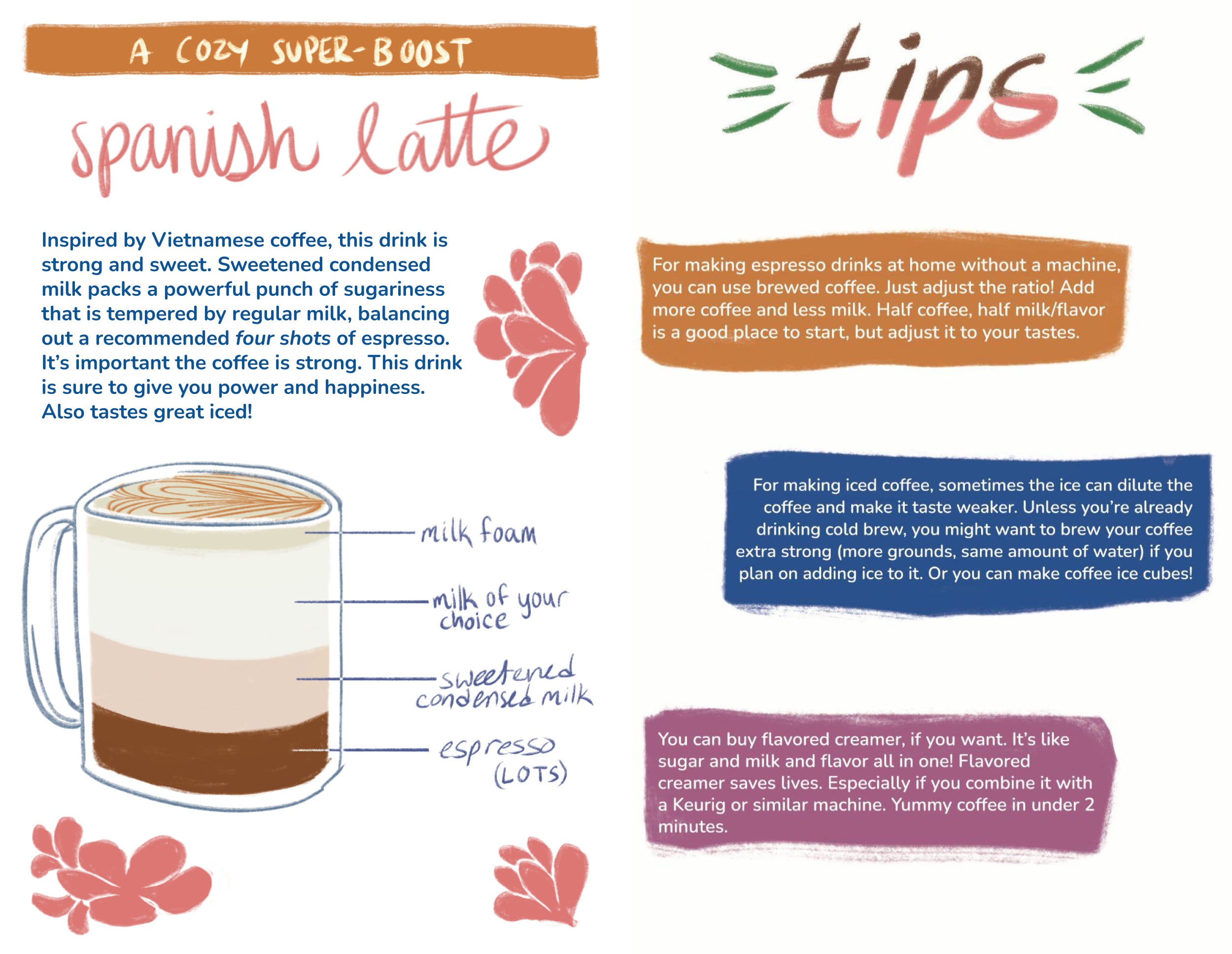
coffee add-ins, suggesting recipes and tips for a creative coffee drinker.
There are a lot of coffee beverages out there to choose from. Plenty of infographics and guides by baristas
exist, and I
want to contribute with my own creative twist. As a barista of seven years who at the time worked at at a
specialty coffee
shop, I had some fun recipes to share. I wanted to make recommendations and provide specific examples rather
than
overwhelm the reader with information, as I've sometimes seen.
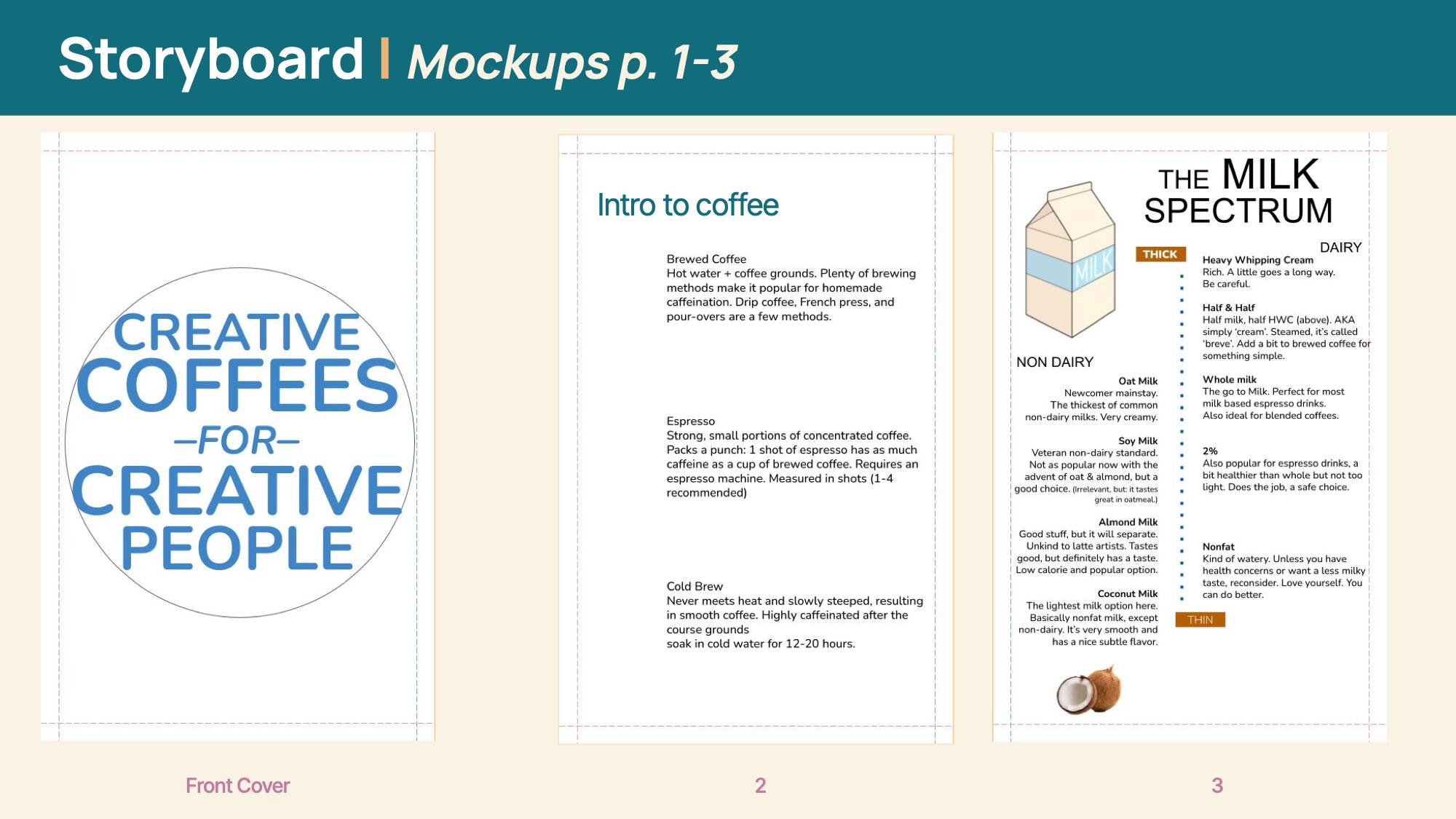
I researched common ways of visually explaining drinks by looking at infographics.
I made recommendations based on mood, displayed layers of drinks, and explained some common ingredients to
give an
idea
of what people have to work with. I went through the documents of my workplace's menu to get an idea of how
to
describe the drinks I featured.
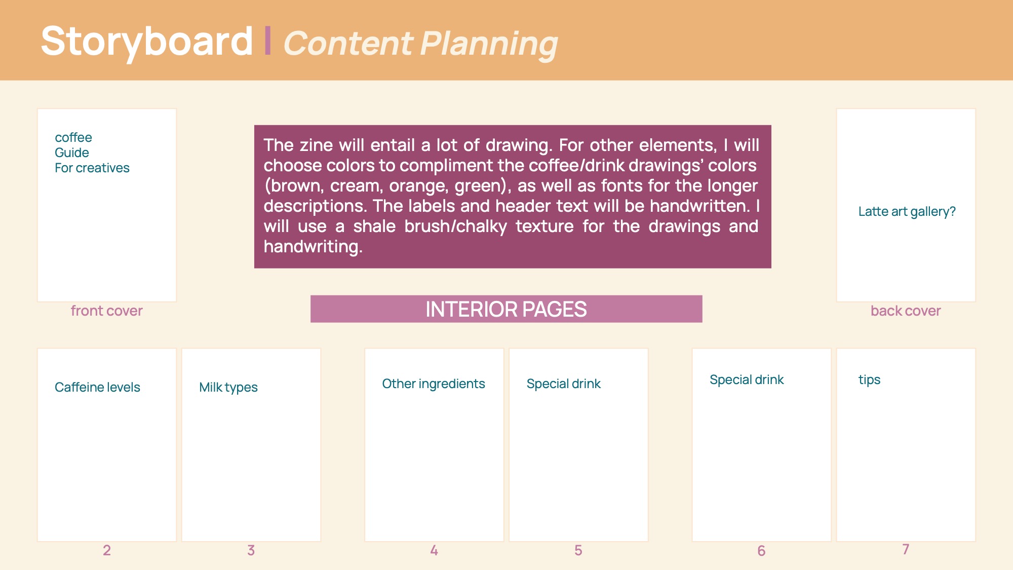
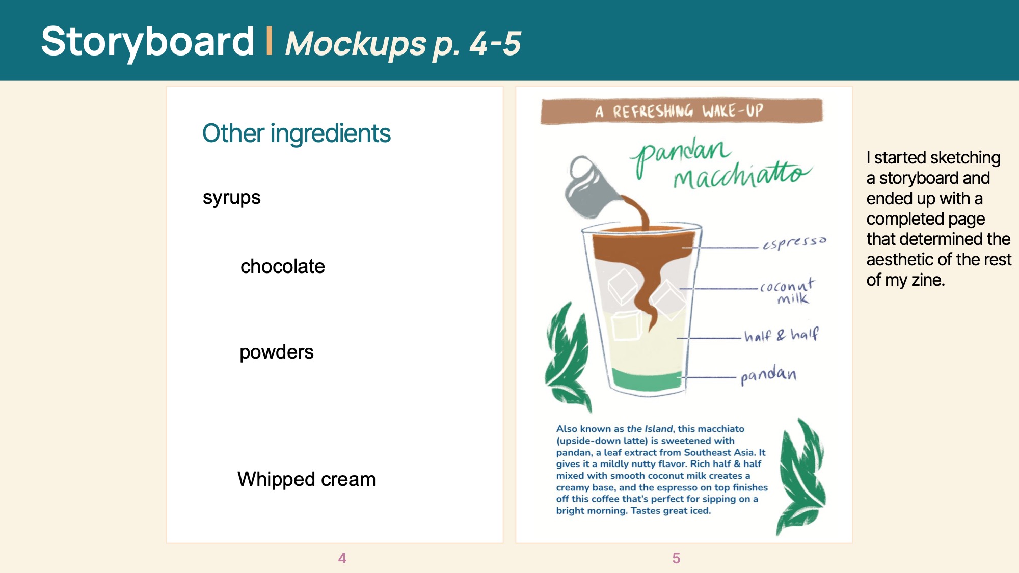
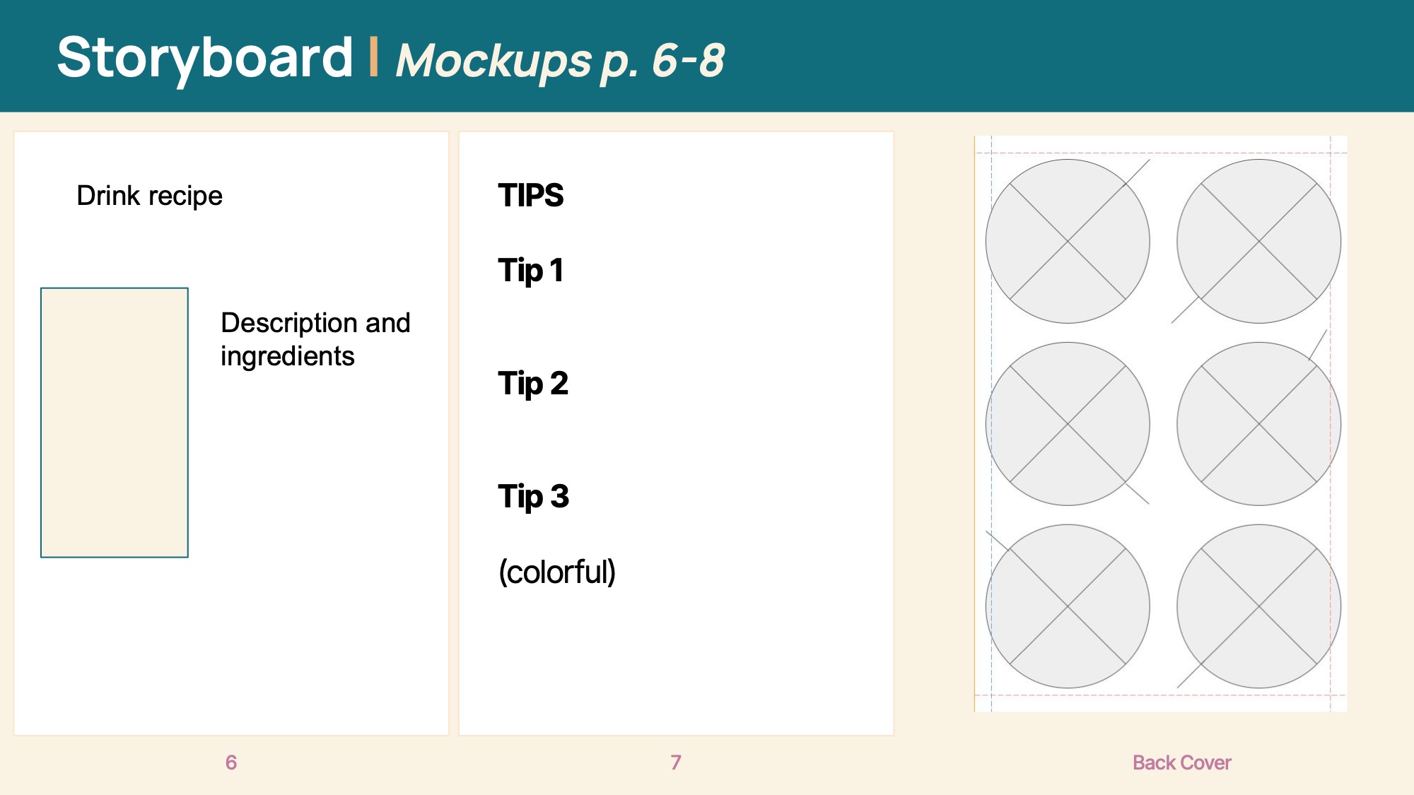
Storyboards
Final Pages
Coffee Zine
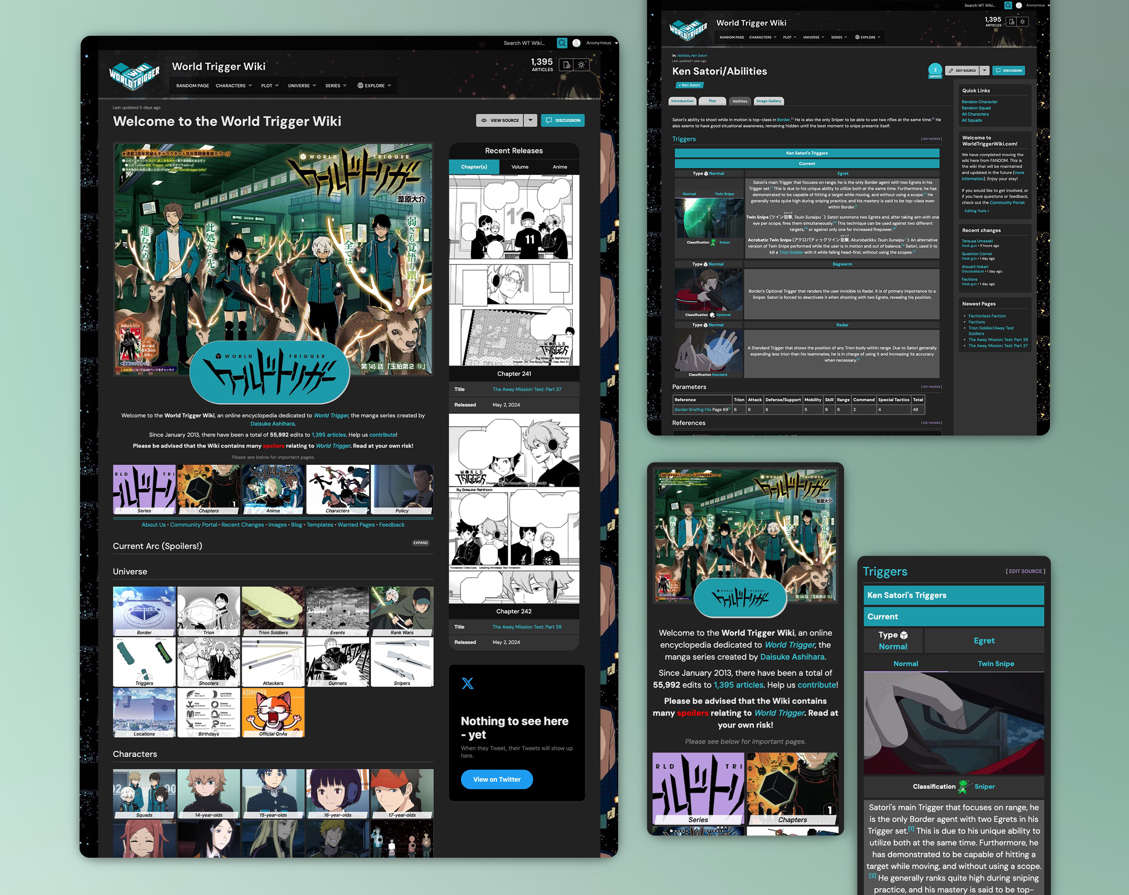
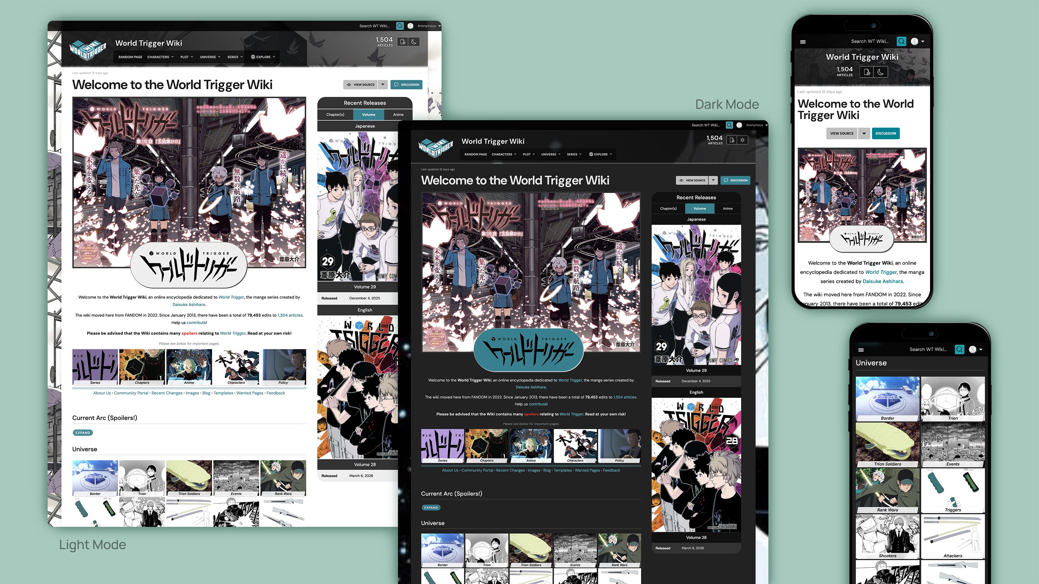
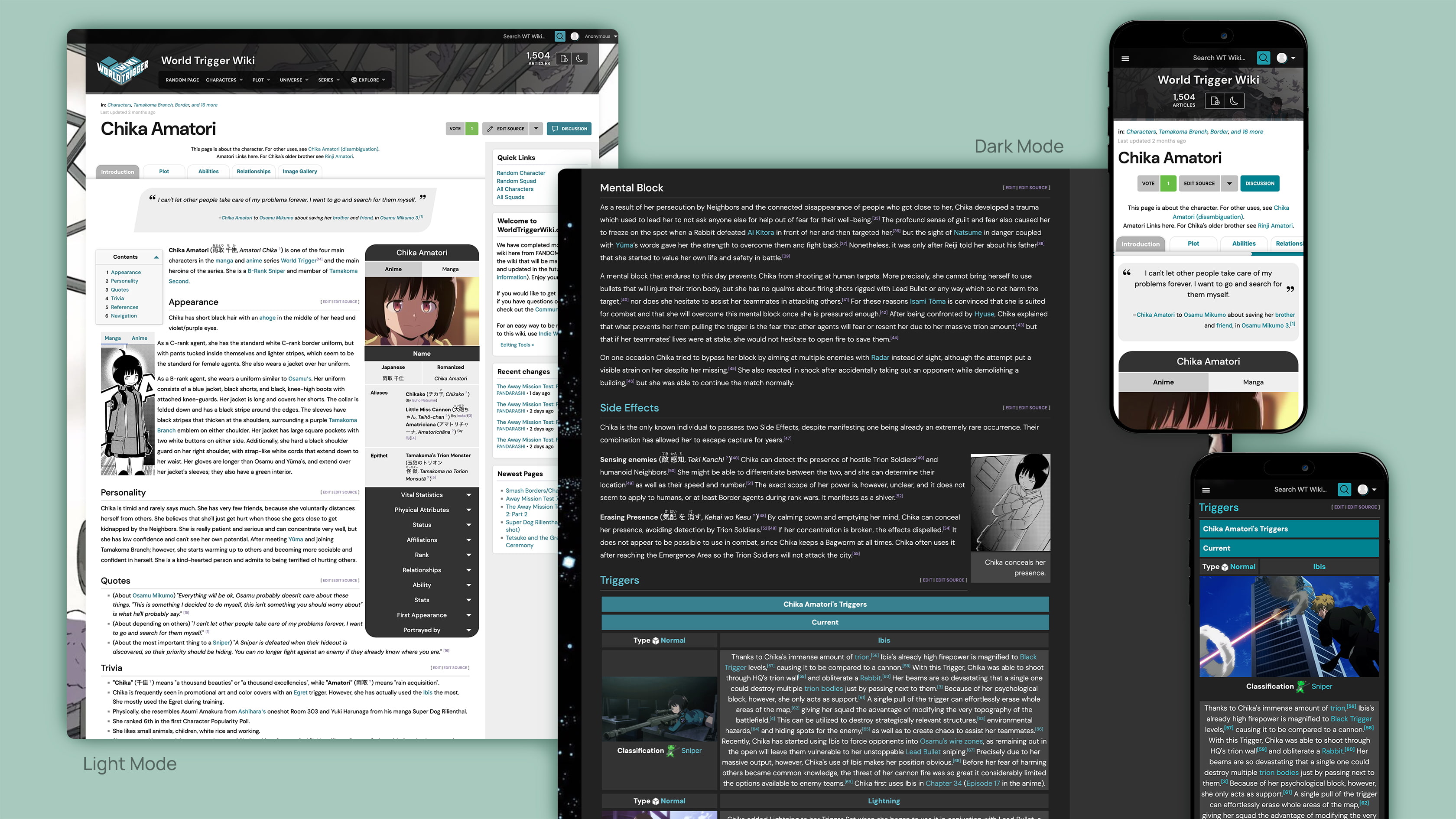
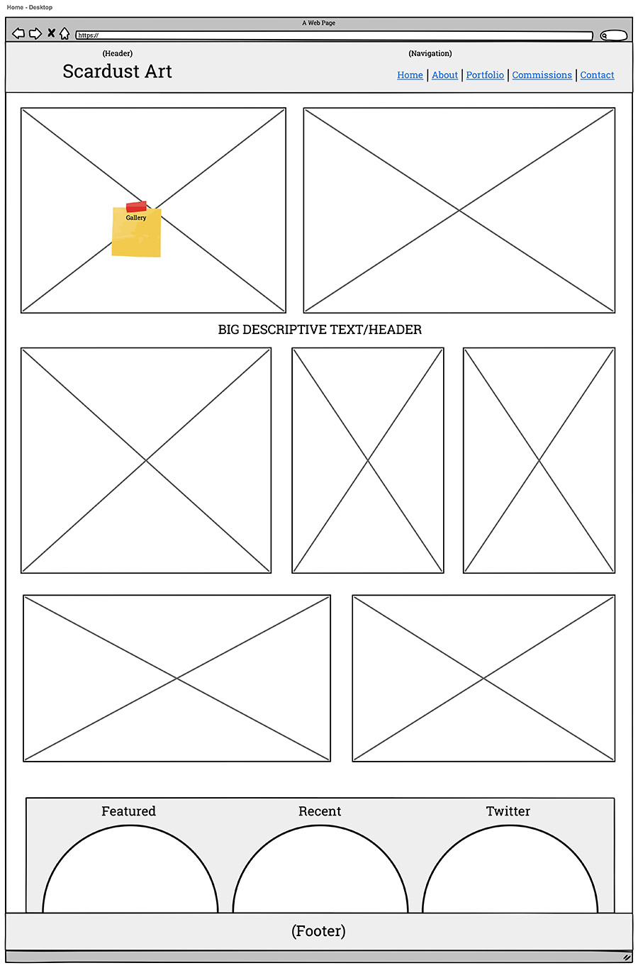
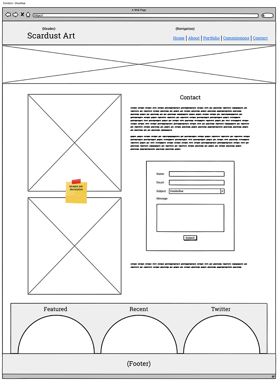
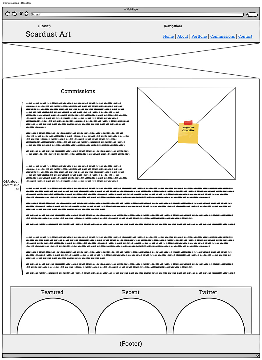
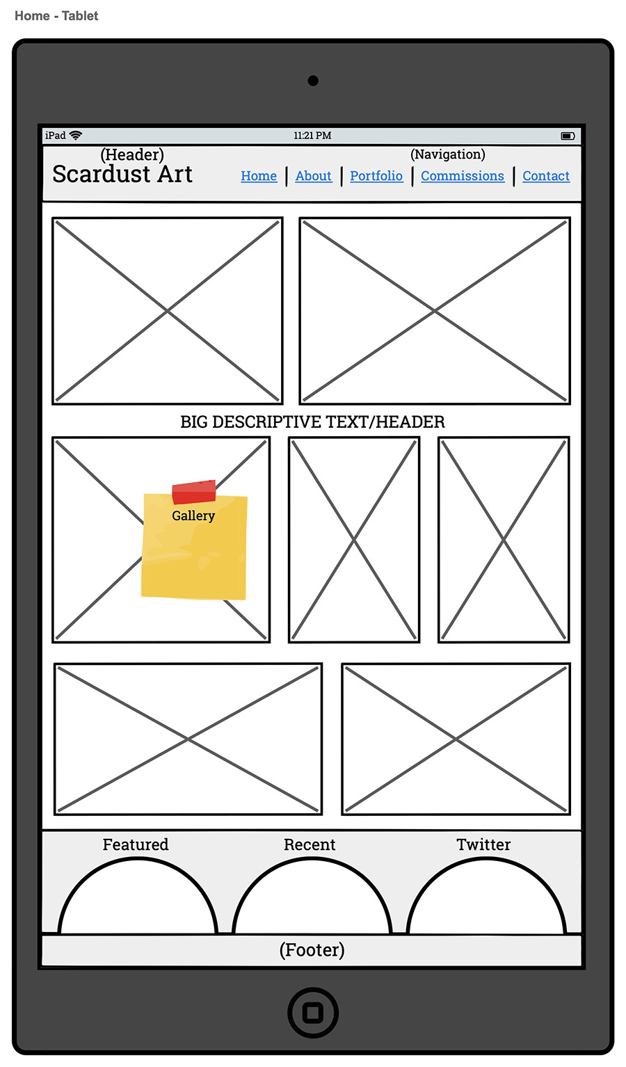
WT Wiki
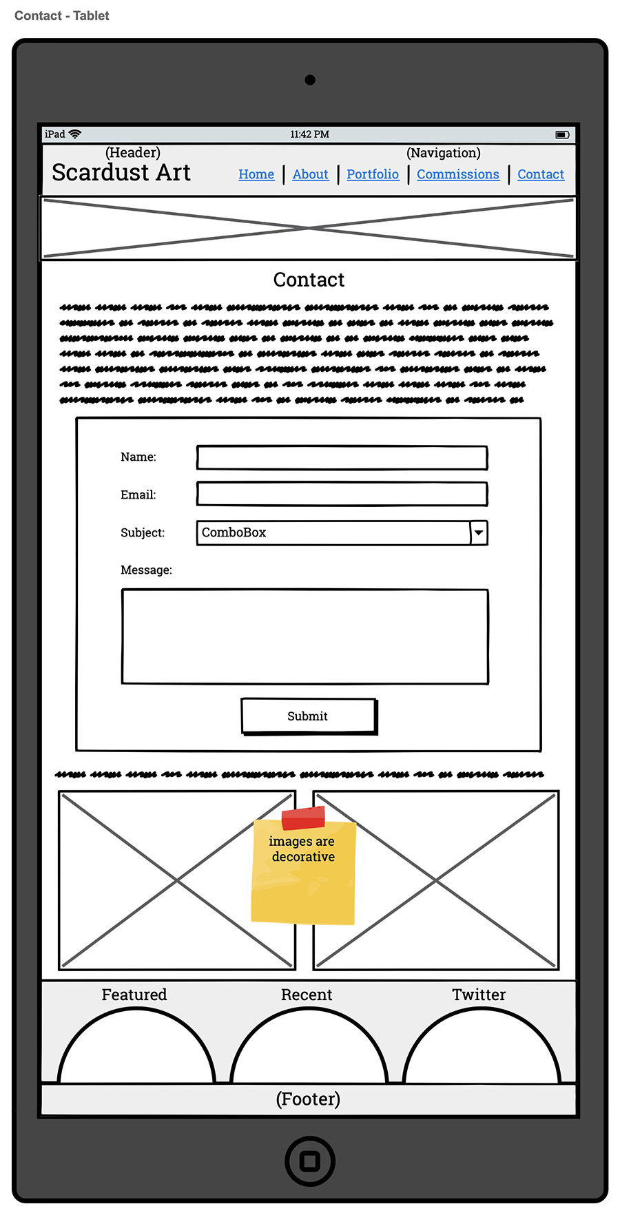
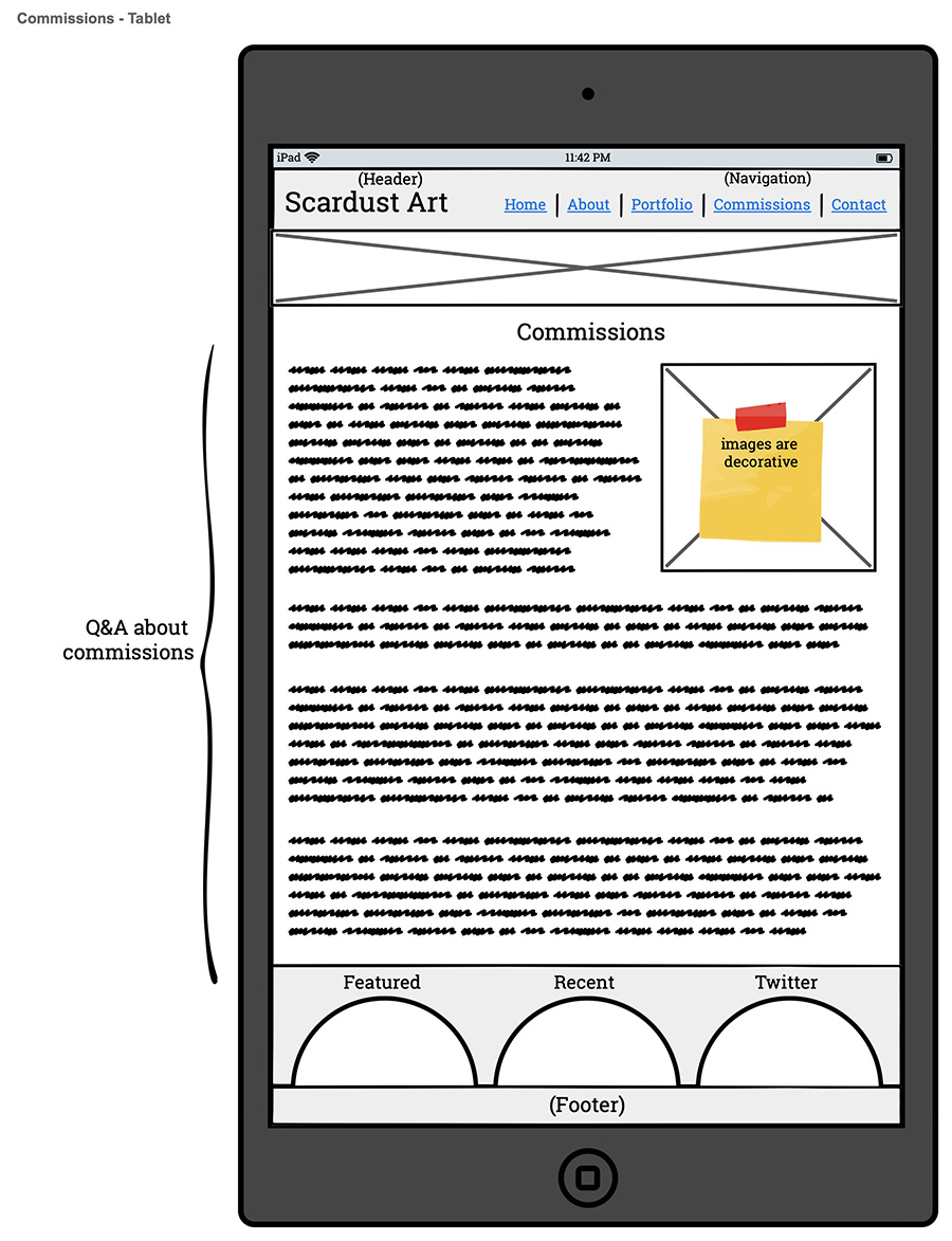
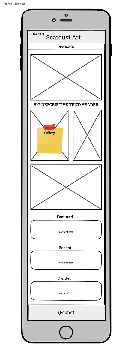
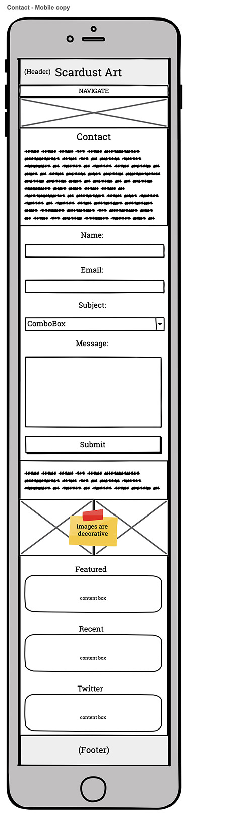
Responsive Website Redesign
Website Design // Information Architecture // Logo Design
The World Trigger Wiki is a fan-run
online encyclopedic resource for the manga and anime series World Trigger.
In October of 2022, the wiki migrated from FANDOM to miraheze, an ad-free wiki farm, and we took
advantage of the move to improve the website by leaps and bounds.
The wiki's main goals for its revamp were:
Make the wiki mobile-friendly.
Develop a dark mode to complement the default light mode.
Create the most user-friendly and intuitive browsing experience possible.
Encourage further exploration of the website.
Technical Limitations
The Mediawiki framework, used by
Wikipedia, uses CSS that is coded using LESS, a CSS compiler. LESS generates very specific CSS that is
very difficult to override with normal CSS, which is the only option for wiki
administrators
who wish to style their wiki.
The workflow for this project was not the most organized, admittedly, since all of the content was
already written, and most of the HTML was untouchable.
In addition, like many data resources, the wiki is very
table-heavy. This made mobile optimization a real challenge. Fortunately, CSS was used to reformat and
rearrange the various tables responsively.
Dark Mode
Mediawiki and the Cosmos Skin, which
was adapted for the wiki's layout, appear to specifically style the framework to have light backgrounds
and dark text. Combined with overriding LESS, this made creating a dark mode version of the website
quite labor intensive, and it required a lot of trial and error. When something was fixed, another thing
broke as a result.
Eventually, we worked out the kinks and made the whole website legible in both light and dark mode, as
well as aesthetically pleasing.
Home Page
Responsive Tables
It is in fact possible to rearrange HTML tables, using the table-layout property. I
converted tables to flex or grid elements and reordered the cells in the clearest way possible.
Logo Redesign
The logo redesign aimed to make it a more compact image with a color related to the series, which was
later used in the website's color scheme. Cubes, particularly glowing ones, are a central feature of
World Trigger and were incorporated with the text.
Global Giving needed a informative, 4-page brochure about their program in Afghanistan. Using the copy and brand guidelines provided, I designed this to fit with their existing aesthetic.
Cover art by Kami.
World Trigger belongs to Shueisha and Daisuke Ashihara.
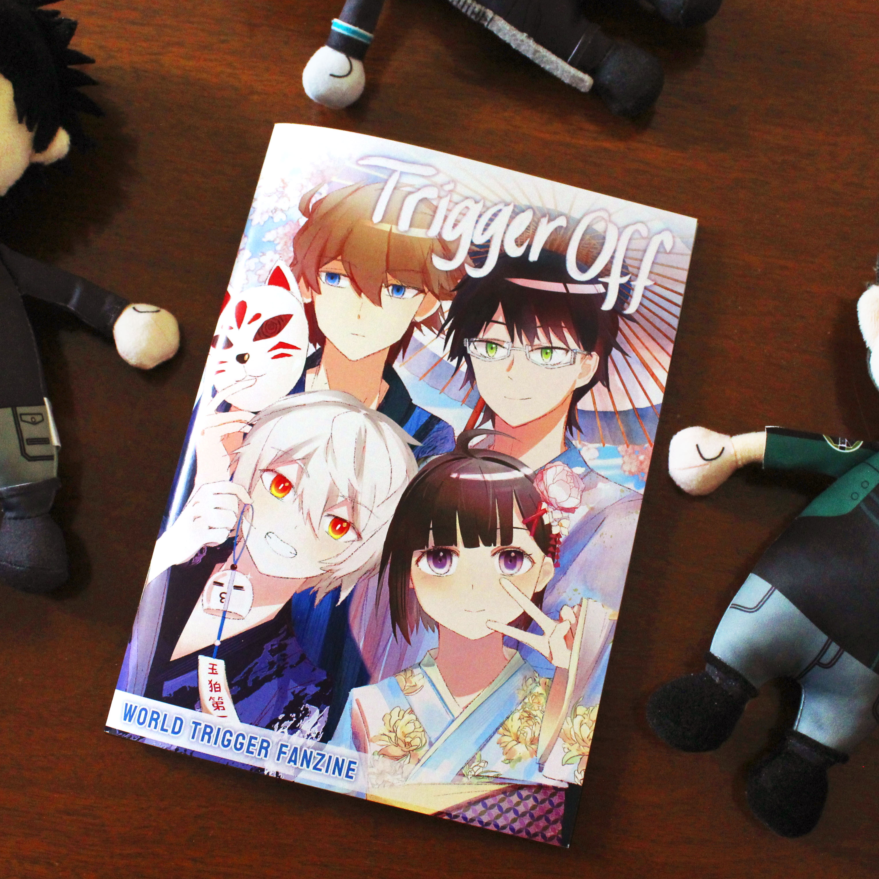
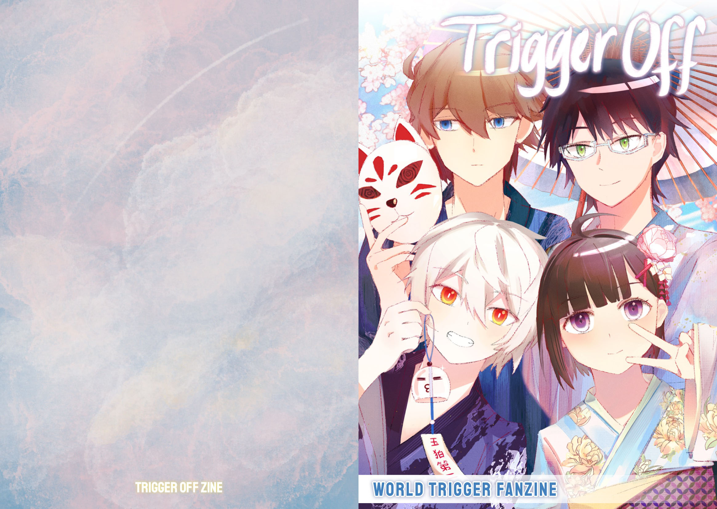
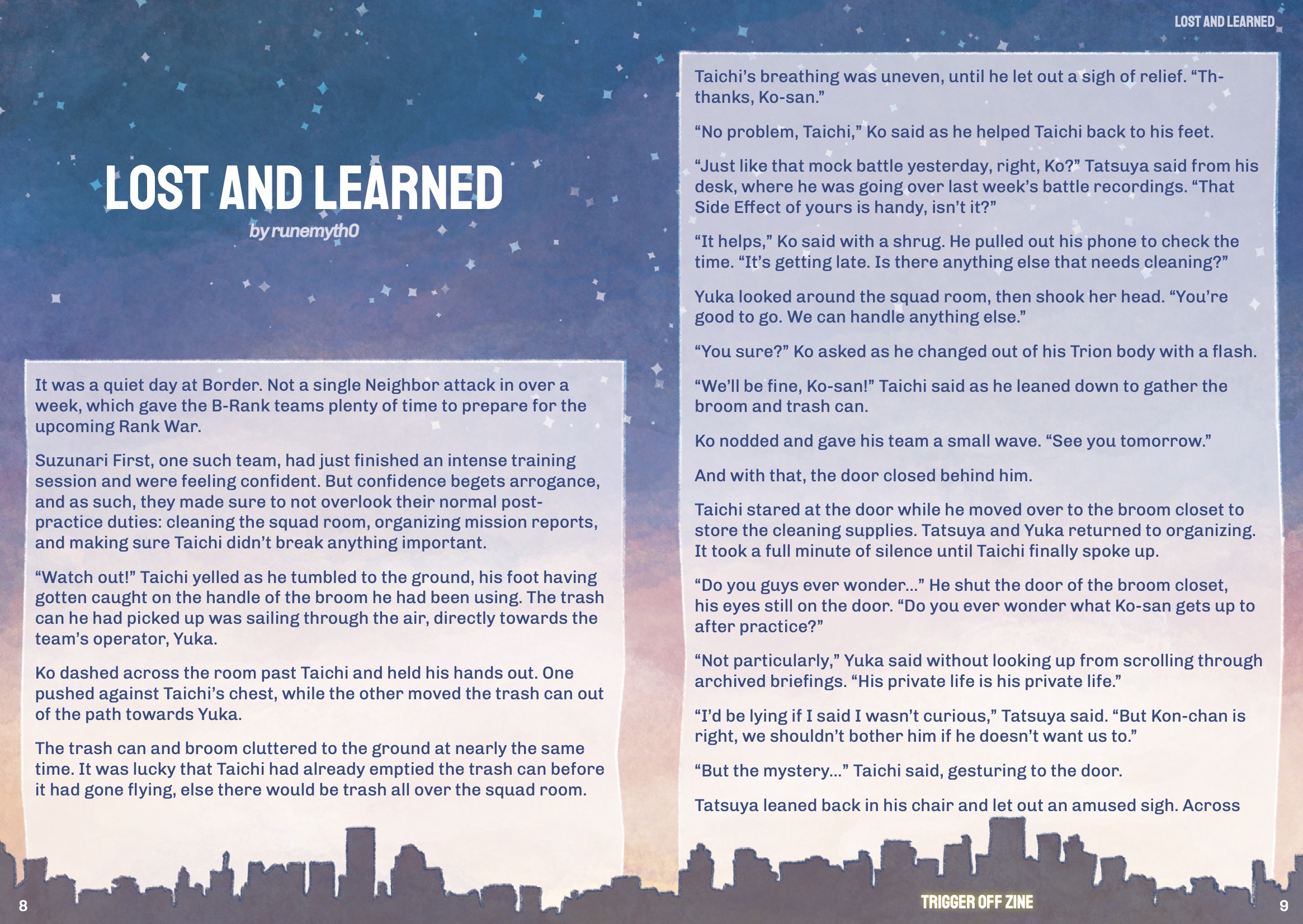
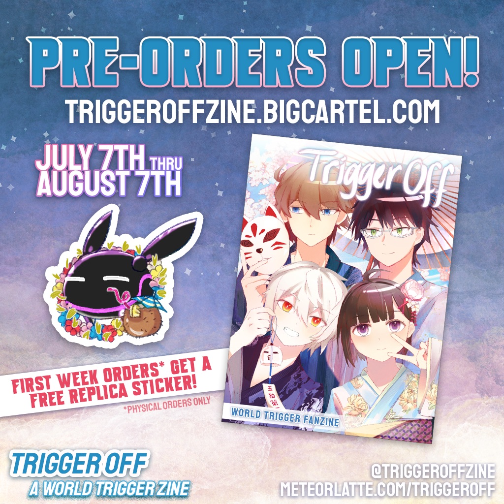
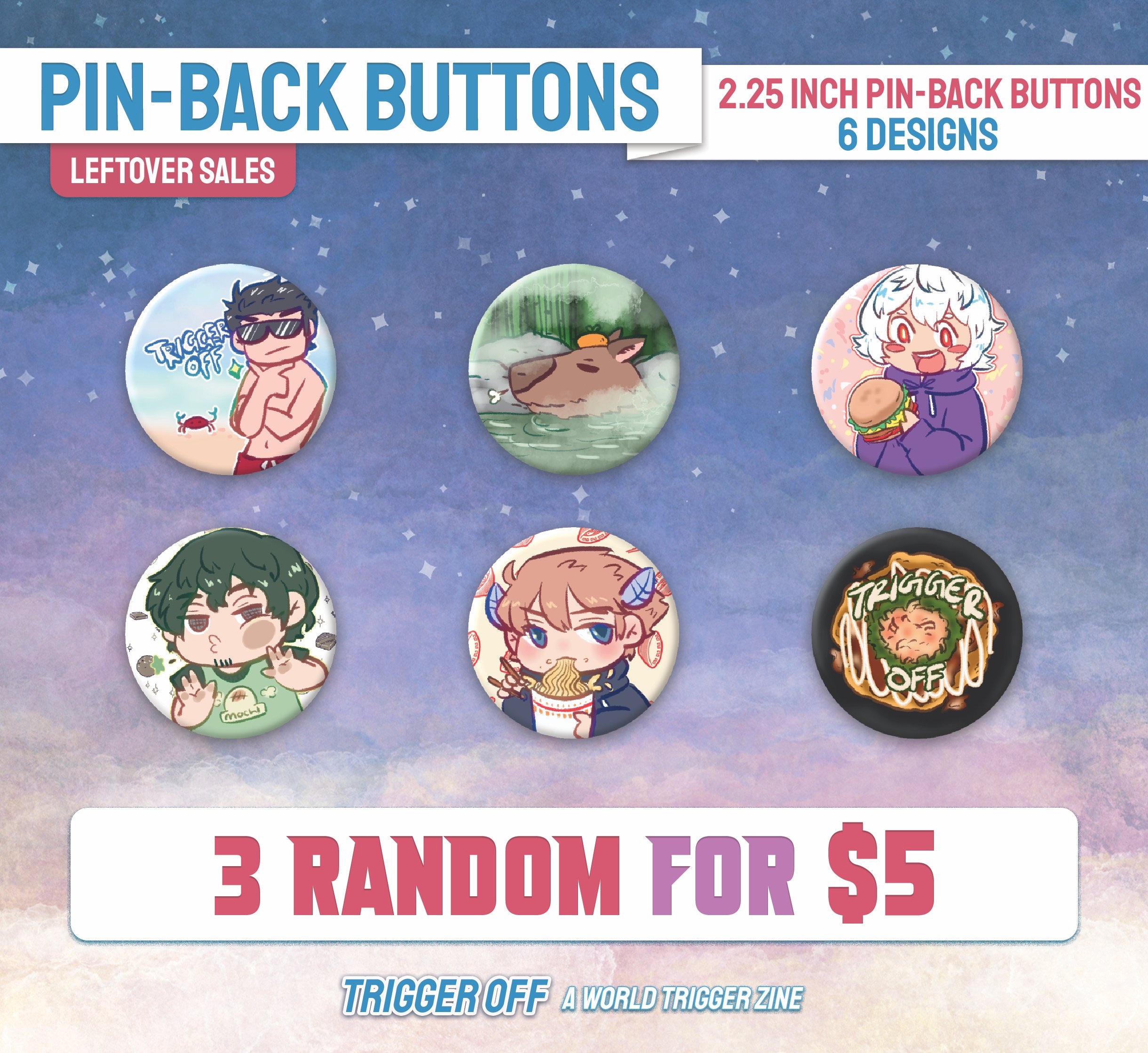
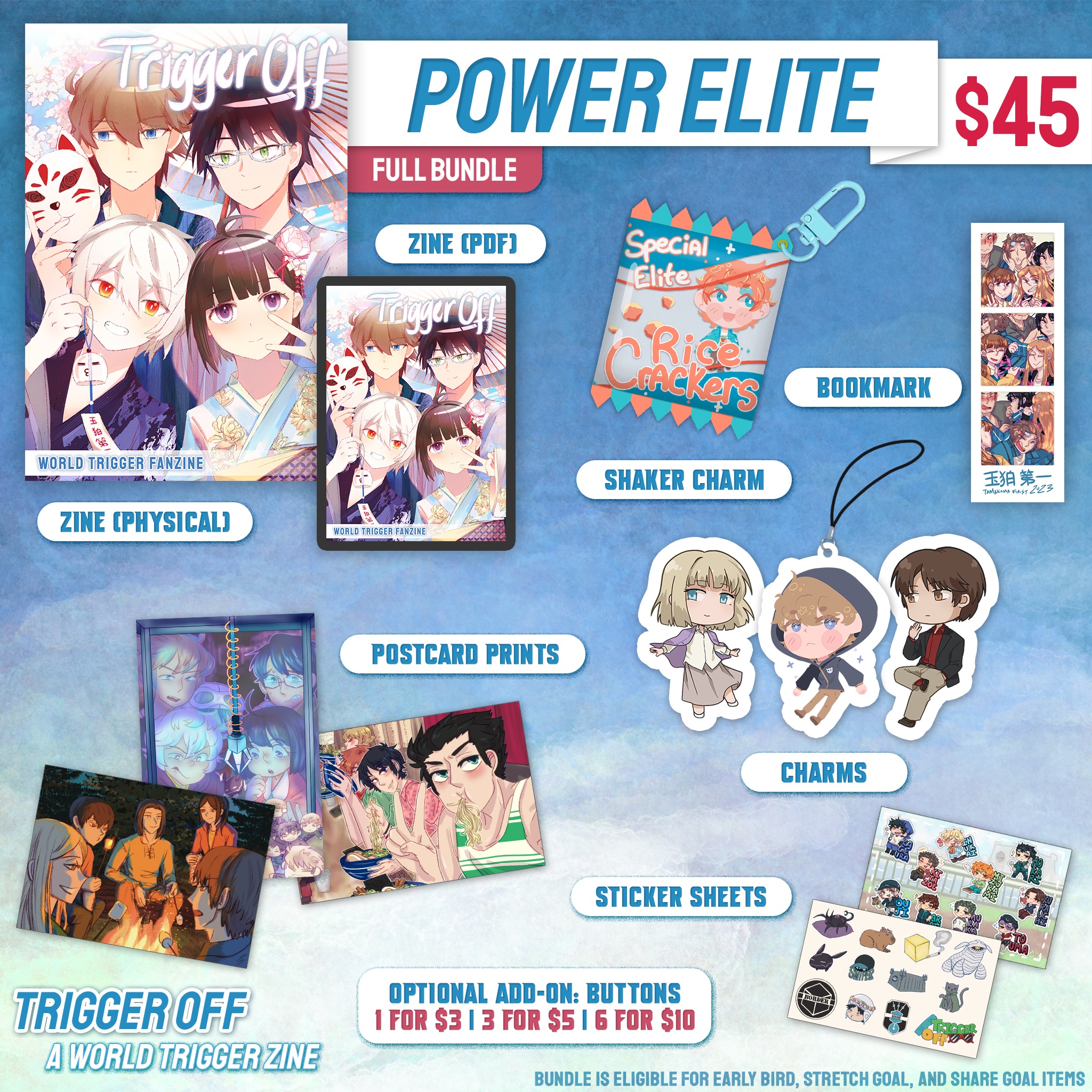
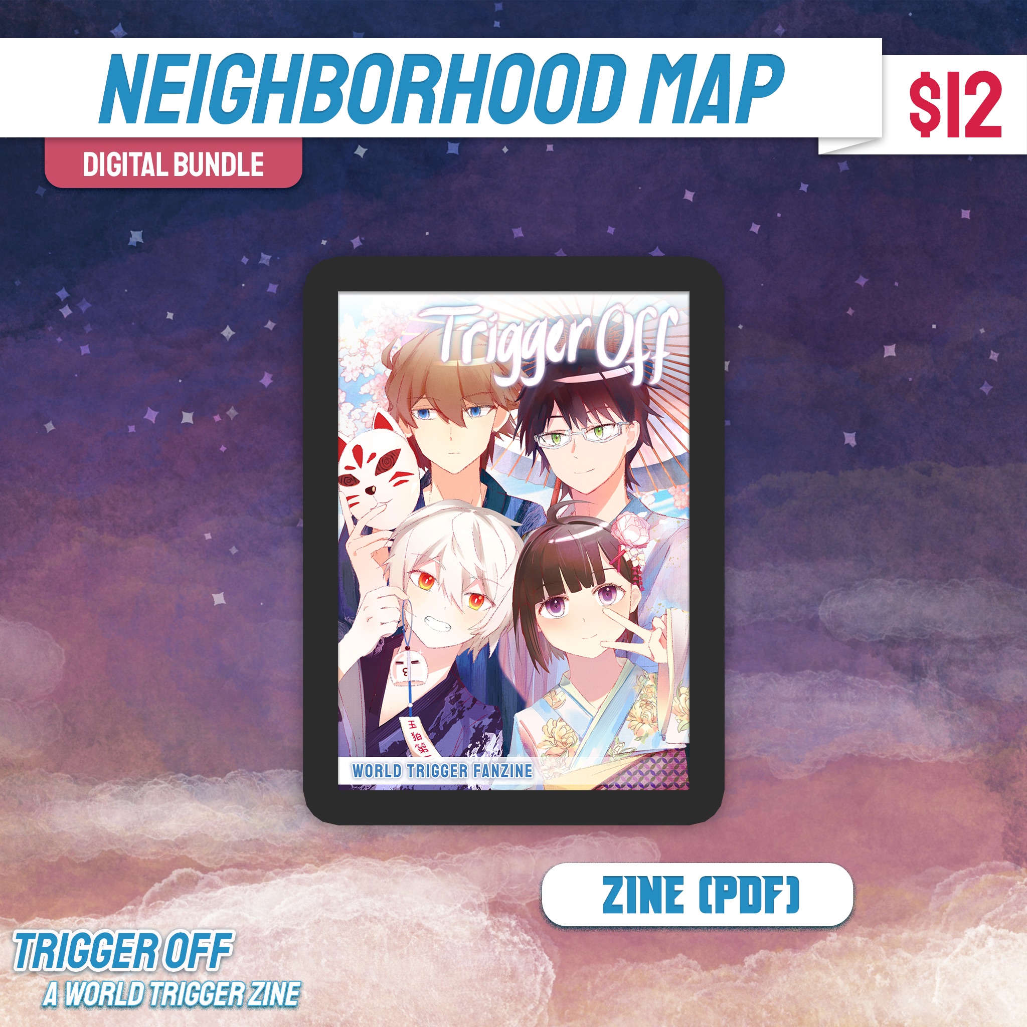
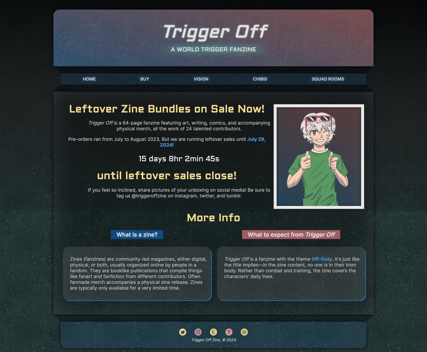
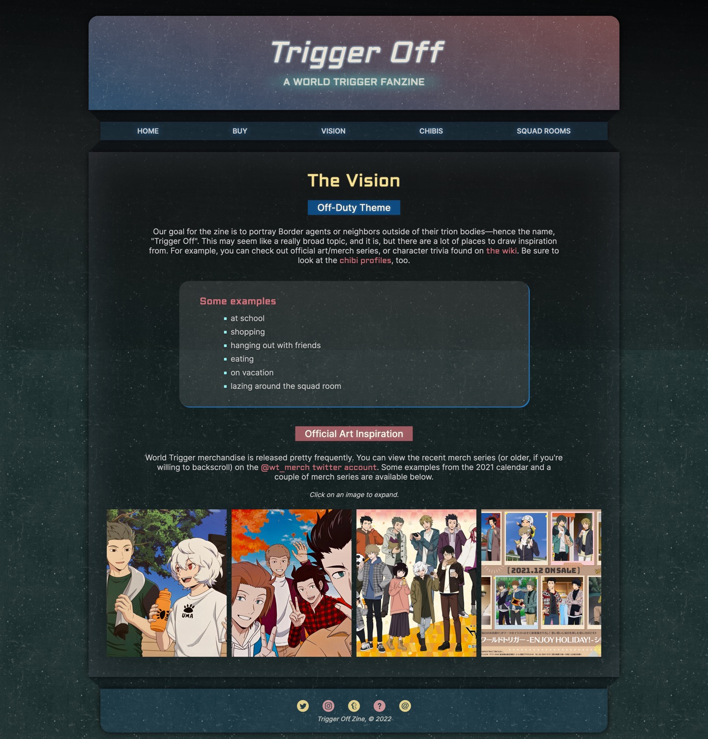
Trigger Off was a fanmade publication inspired by the series World Trigger by Daisuke
Ashihara. The zine was produced during 2022-2023. It was released digitally and in print, accompanied by
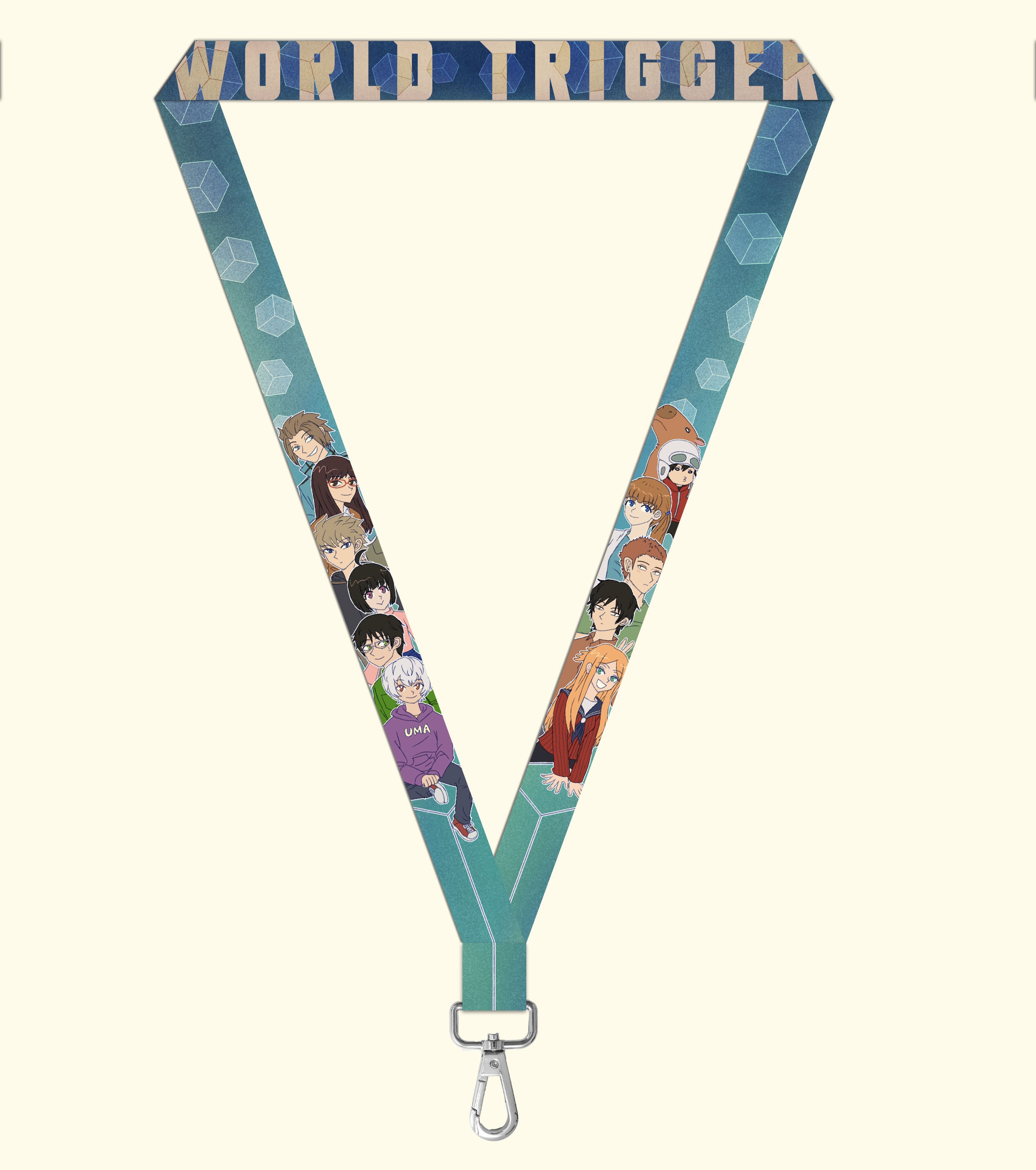
various merchandise designed by the team.
The lead organizer of the project was primarily responsible for website development, assembling the zine
for
pdf and print, illustrating assets, and making various graphics for advertisement and the online shop.
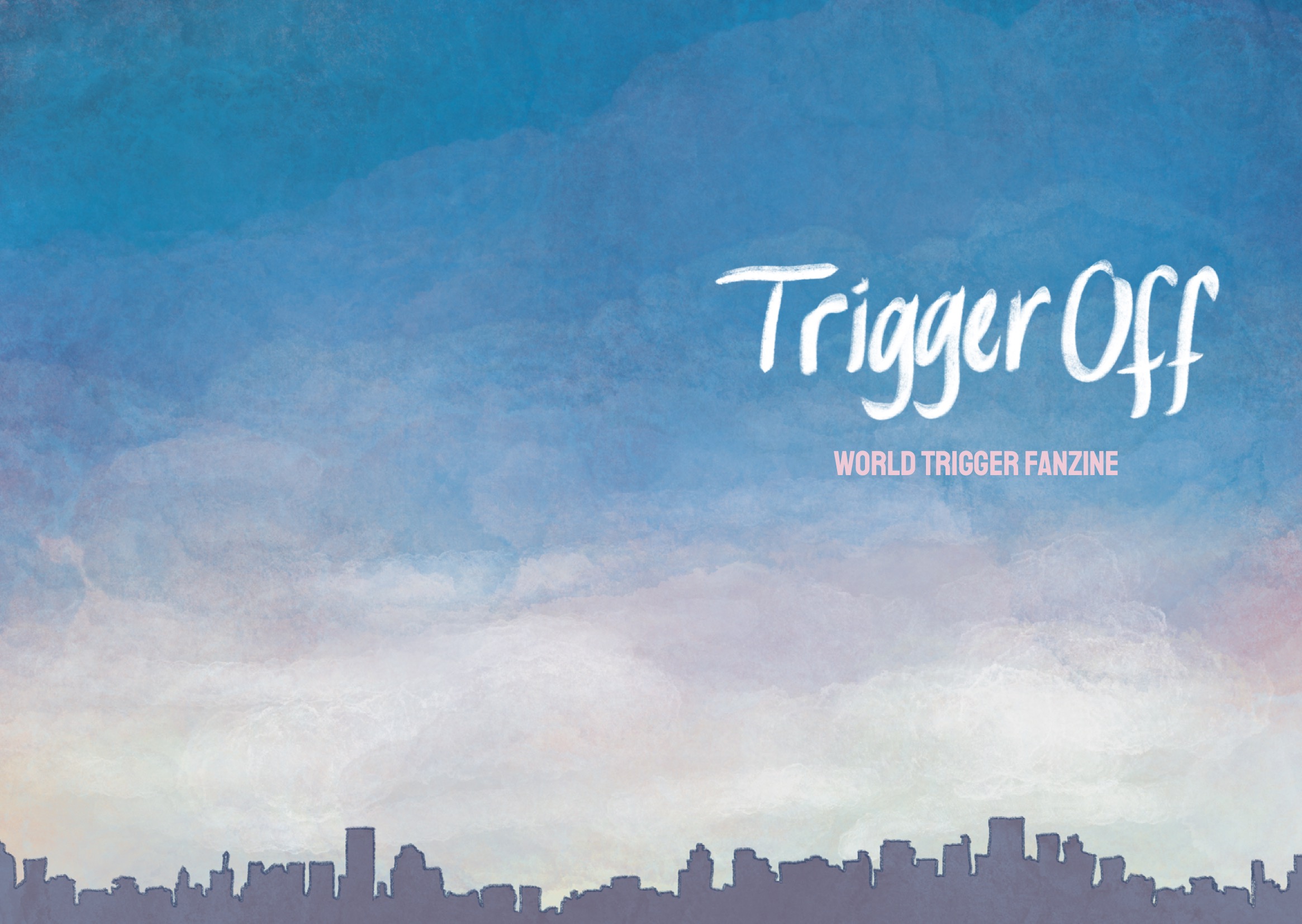
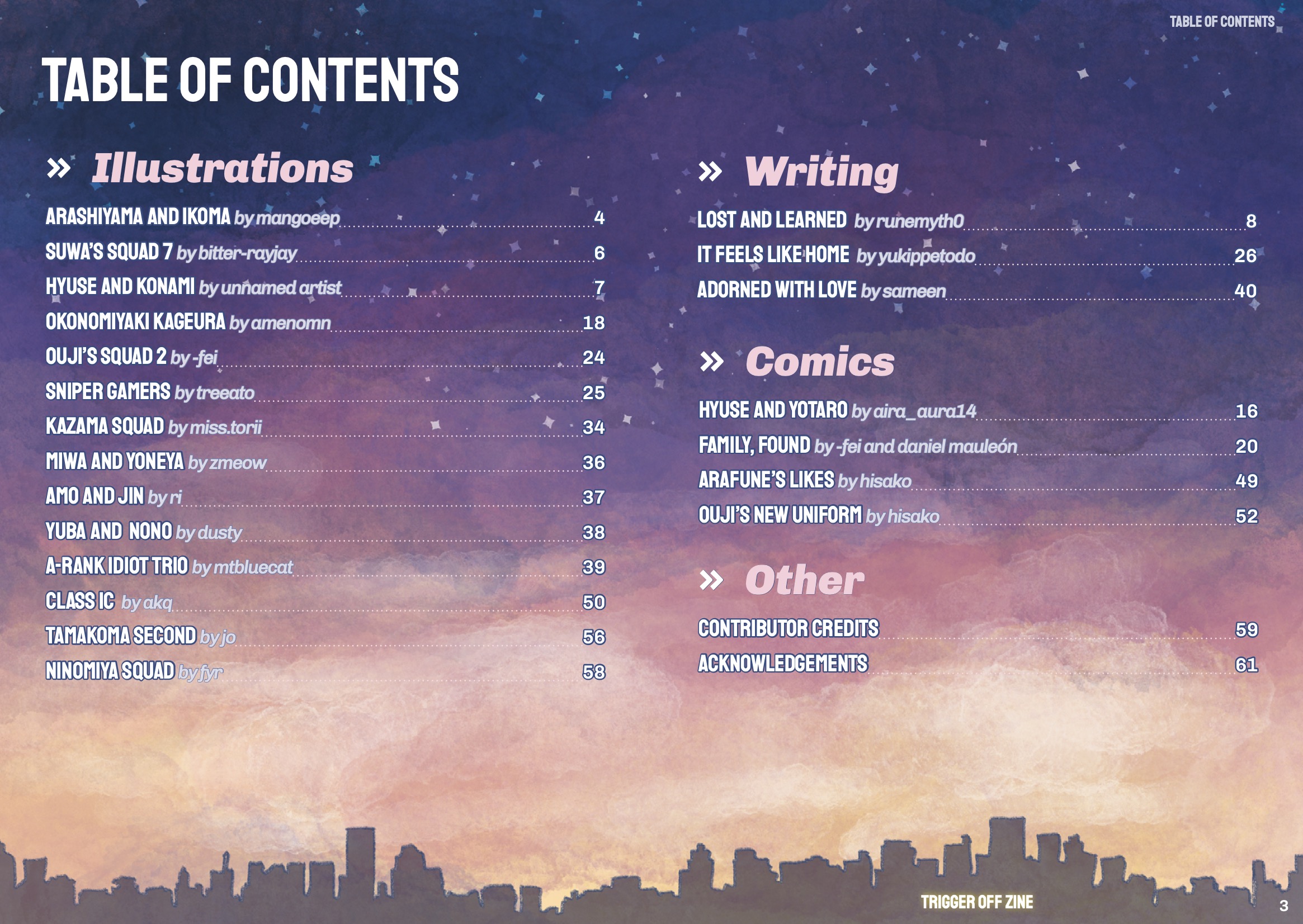
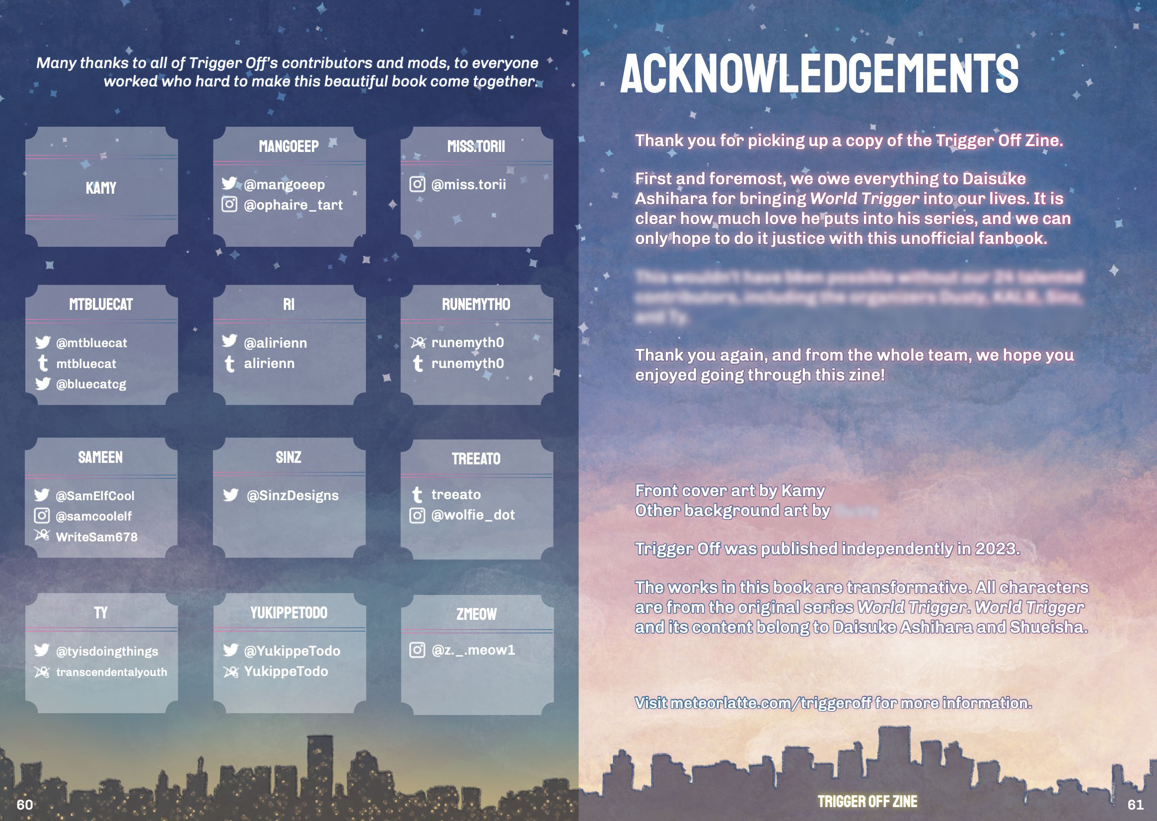
Zine Layout
Meticulous layout design and formatting of the zine, both for PDF and print. Cover art by Kami.
Front and Back CoverInner (Front)Table of ContentsInner (Back)
Time of Day Transitions
Sky and cityline backgrounds (illustrated by the designer) are placed so that, as the pages are turned,
the
time of day changes.
Story Title Page - SunriseStory - DayStory - SunsetStory - Night
Shop/Ad Graphics
A sample of graphics created for social media and to represent bundles in the online shop.
The zine website served many purposes throughout the production process, such as spreading awareness,
providing inspiration for participants, providing information for both participants and customers, and
acting as a hub with links to social media and the online shop.
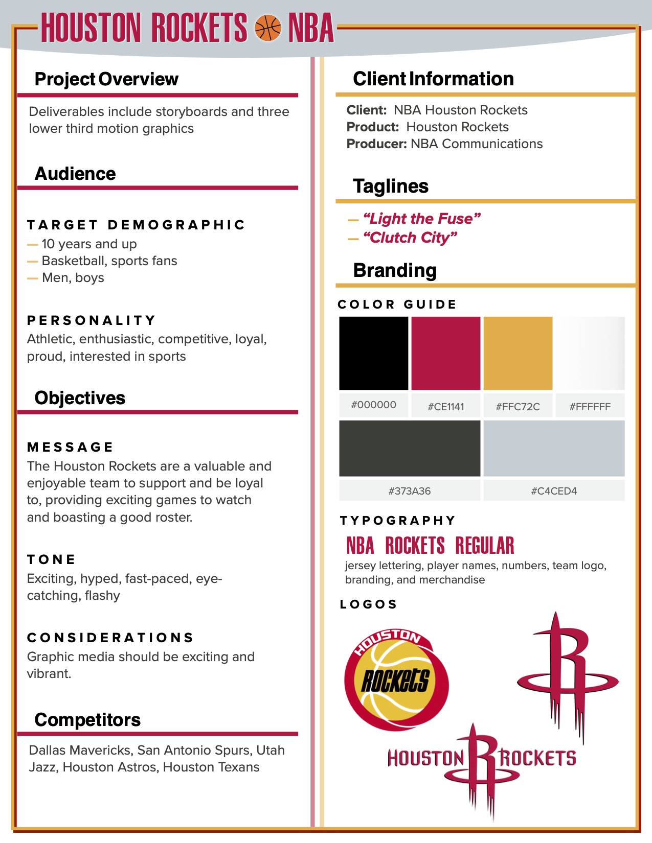
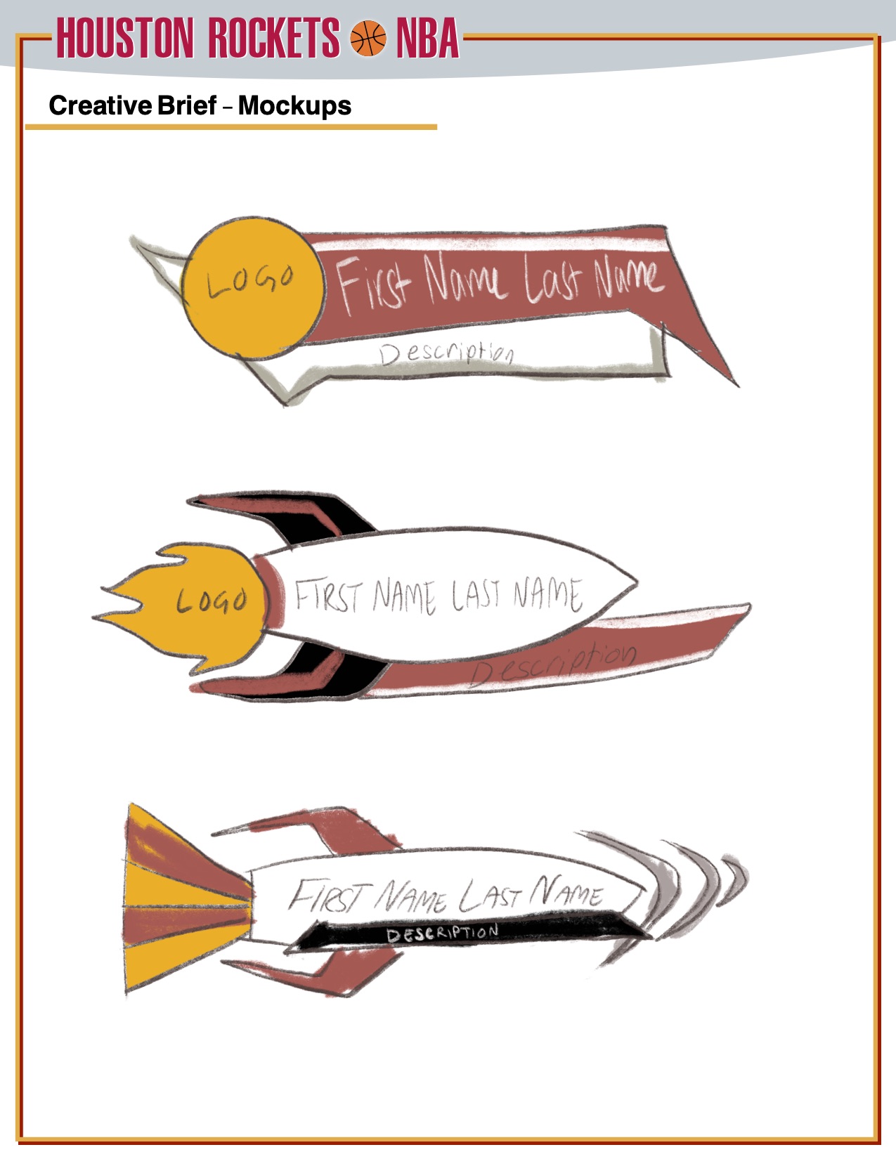
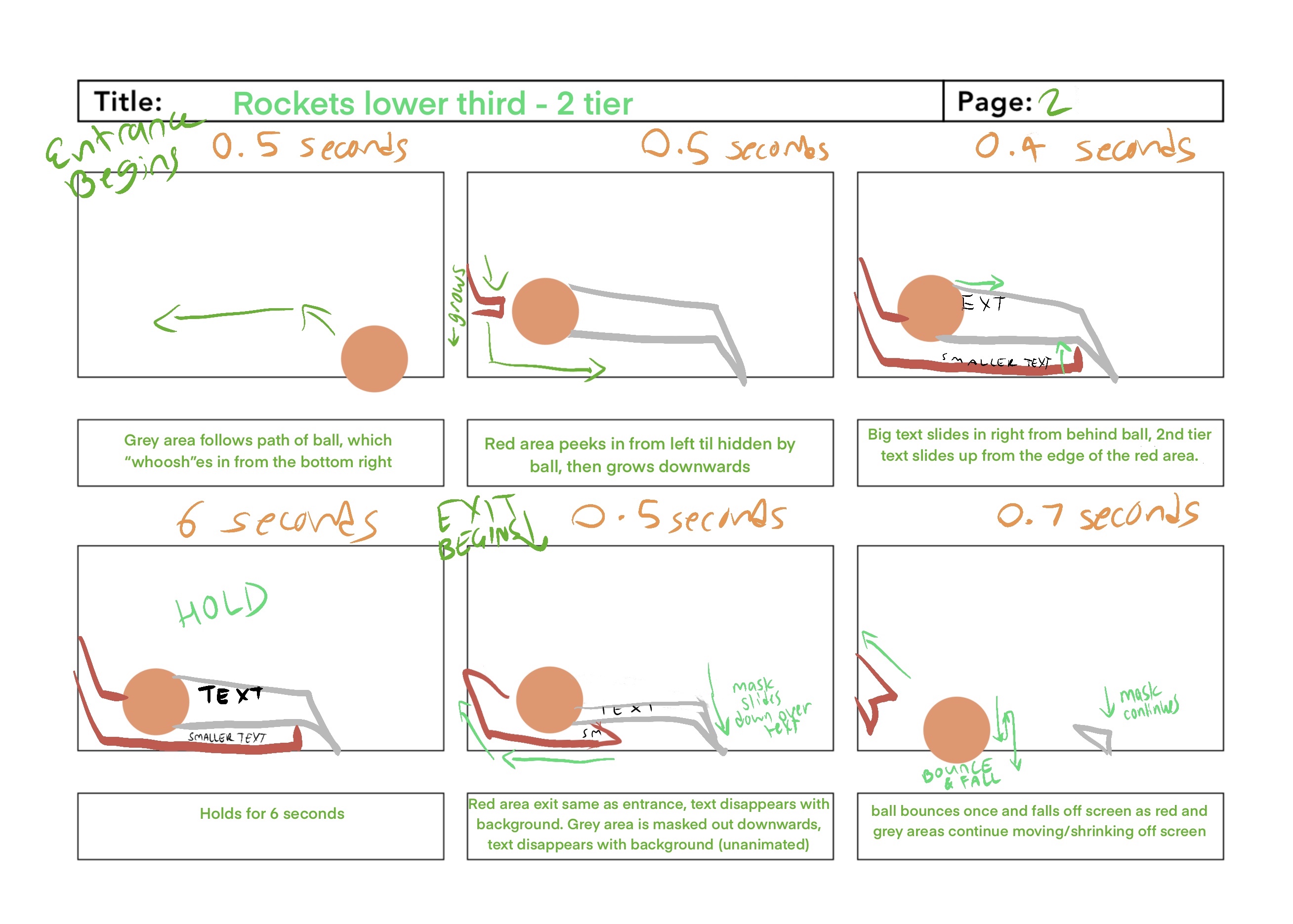
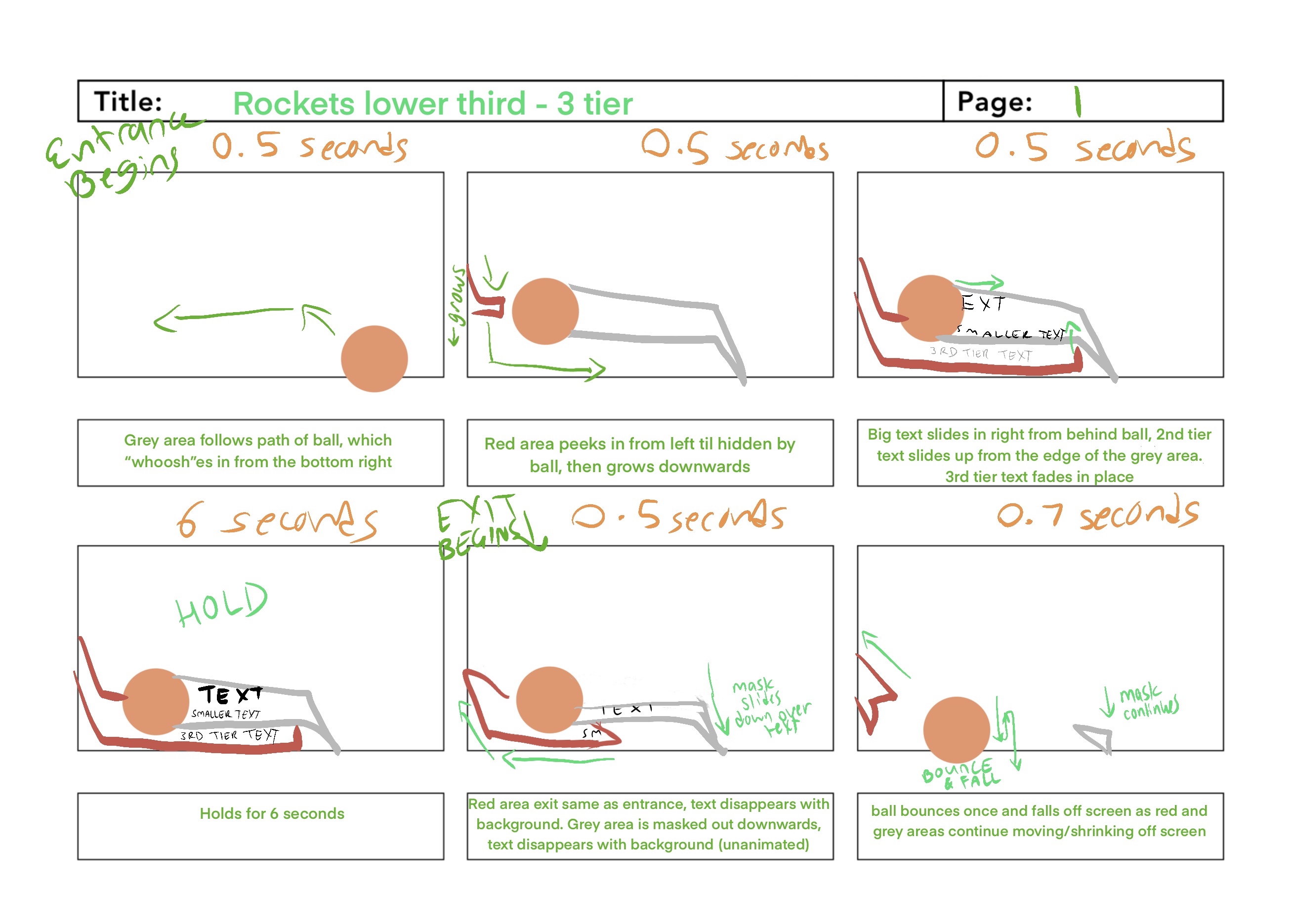
Three tiers of lower thirds were requested to support footage of the NBA Houston Rockets. A
basketball shape was created and animated for all three of the lower thirds. Text is introduced
seamlessly with fluid animated effects and transitions.
Note: This project is unofficial and is not affiliated with the NBA Houston
Rockets. The Rockets Logo and font are property of the NBA Houston Rockets, used for educational
purposes only.
Creative Brief
Creative BriefInitial Sketches
Storyboards
2-Tier Storyboards3-Tier Storyboards
Final Animations
1-Tier2-Tier3-Tier
Lower Thirds
motion
PBS Arizona
Animated Bumper
animation // video // motion design
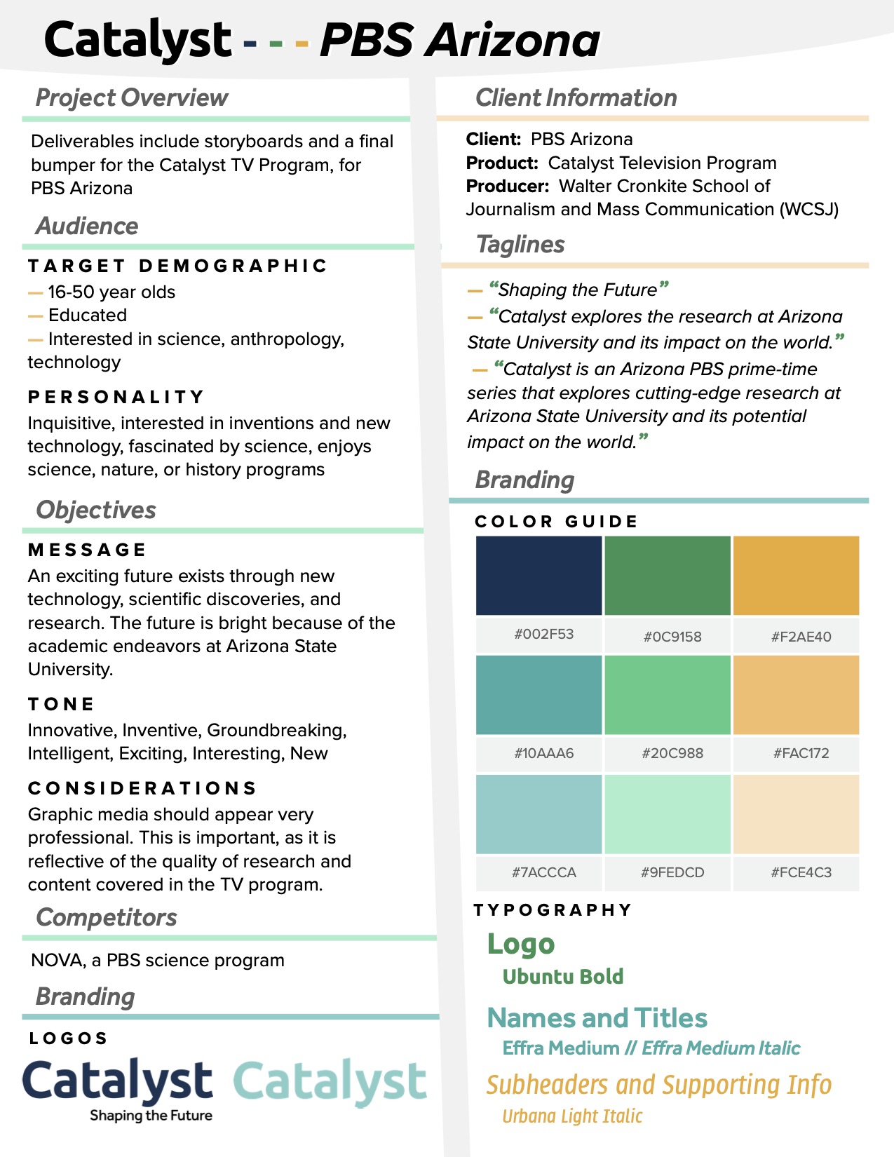
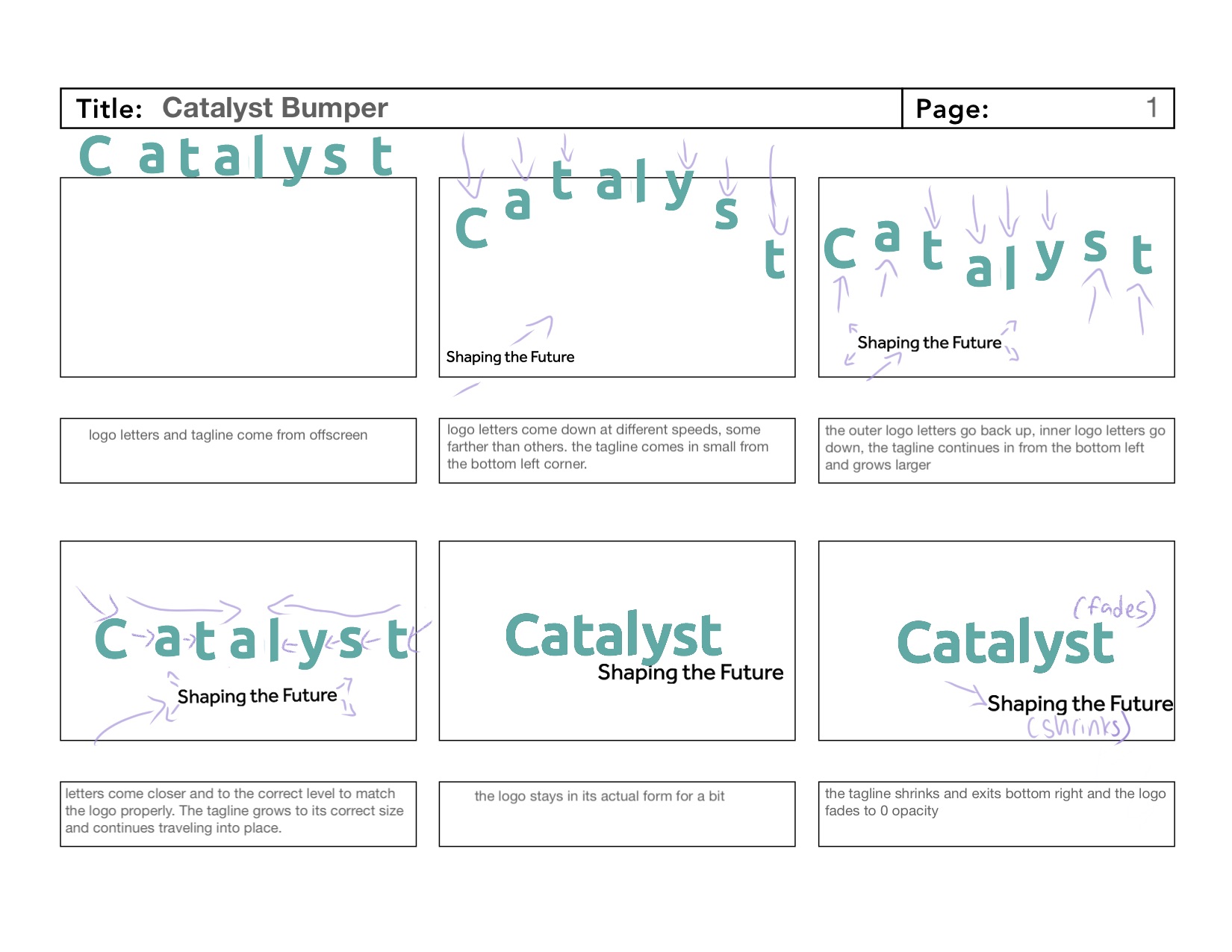
PBS Arizona needed a commercial transition bumper for their Catalyst program. Following the provided brand guidelines, an animation of the logo and tagline was created, as seen above.
Creative Brief
Storyboards
Bumper
motion
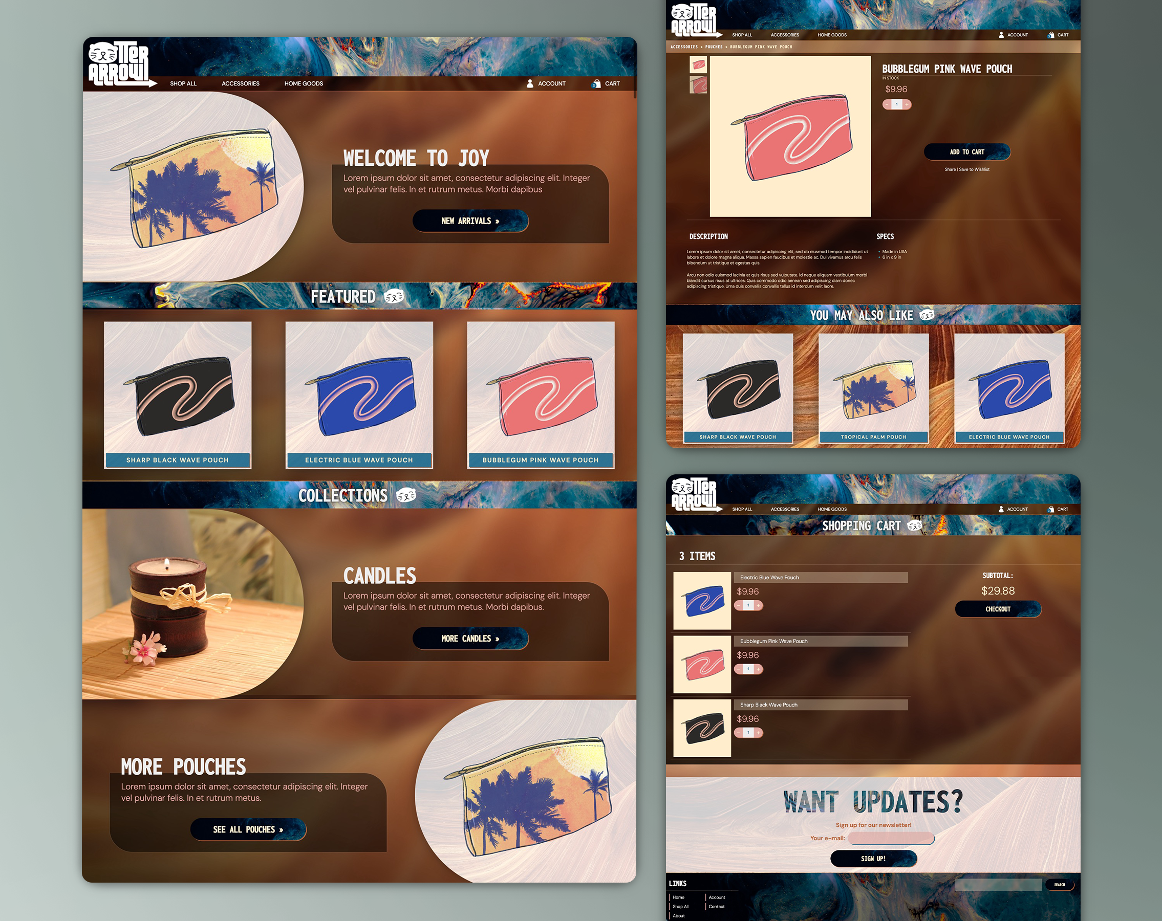
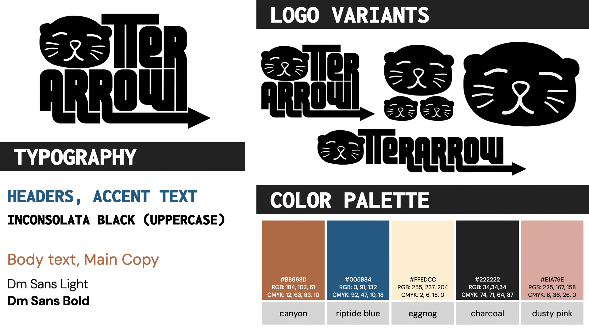
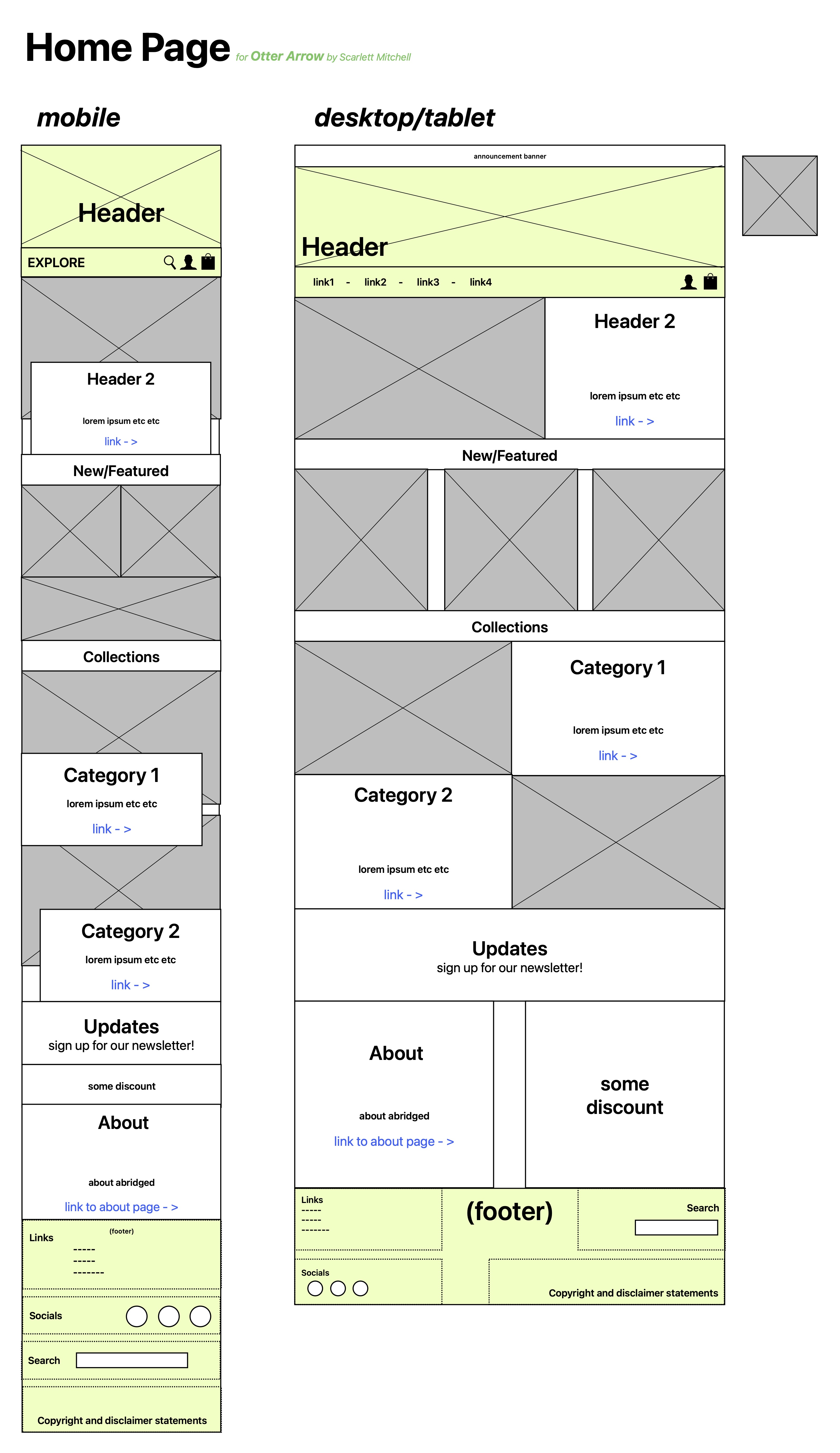
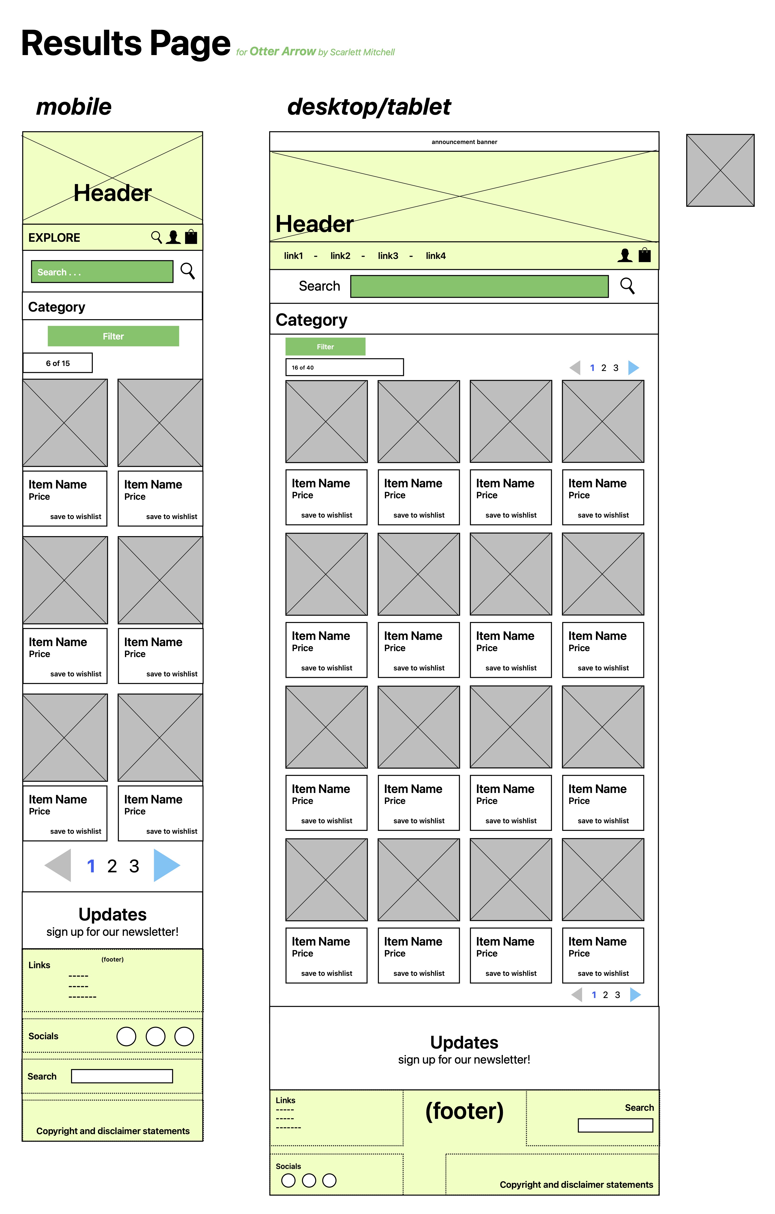
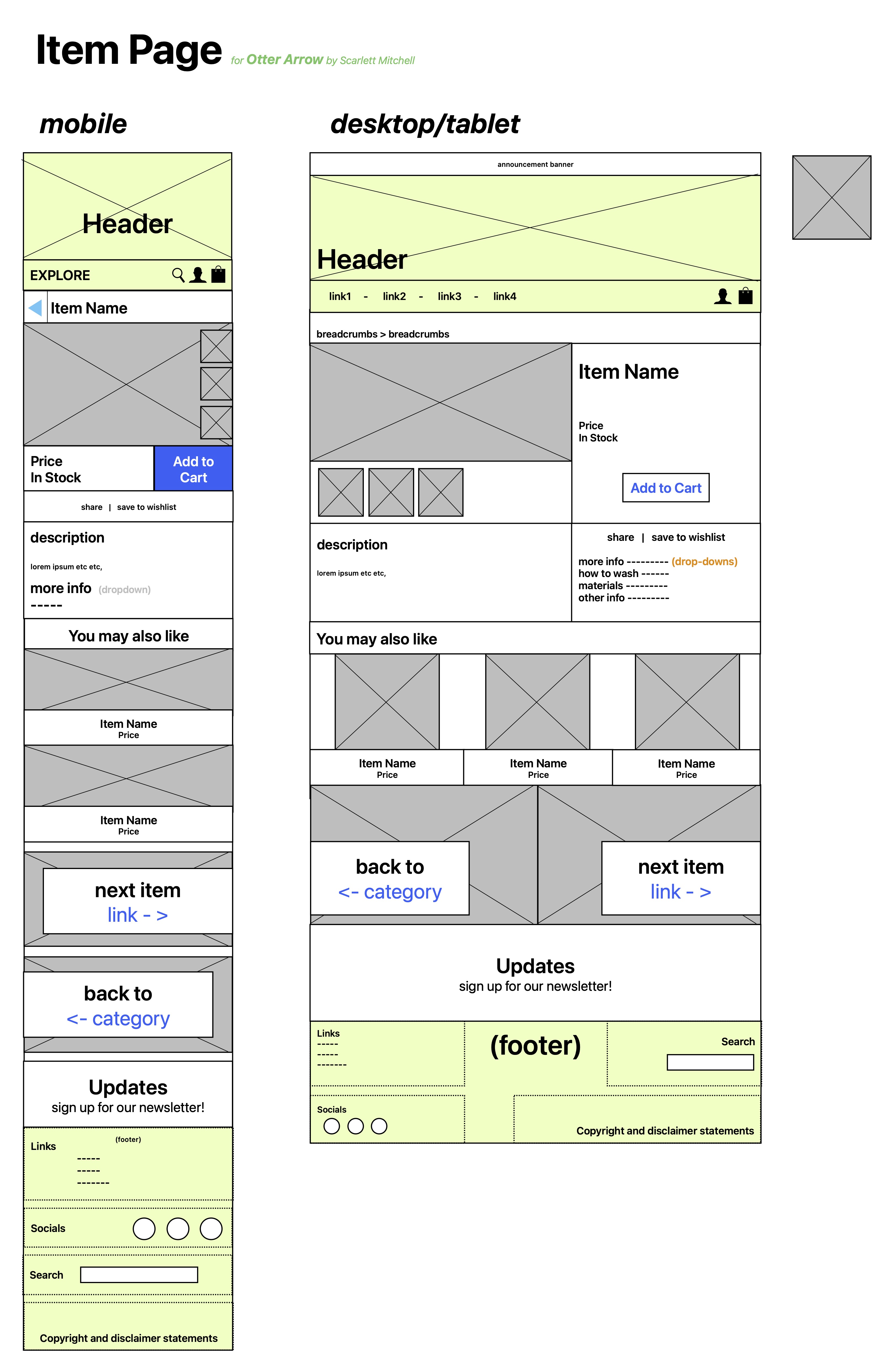
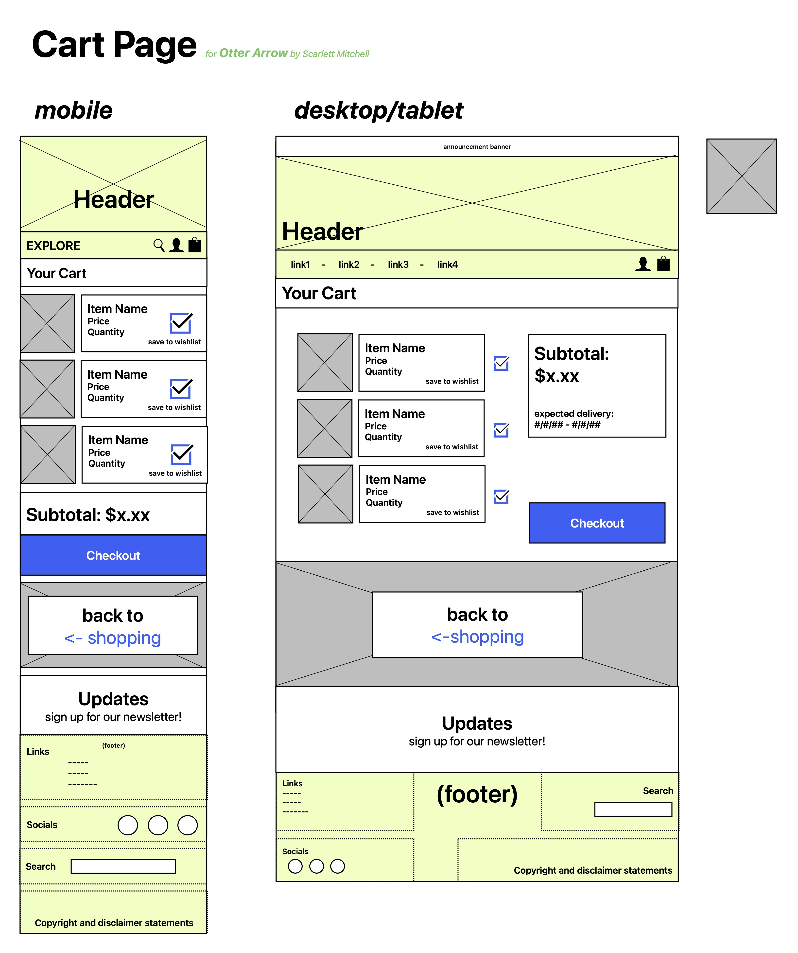
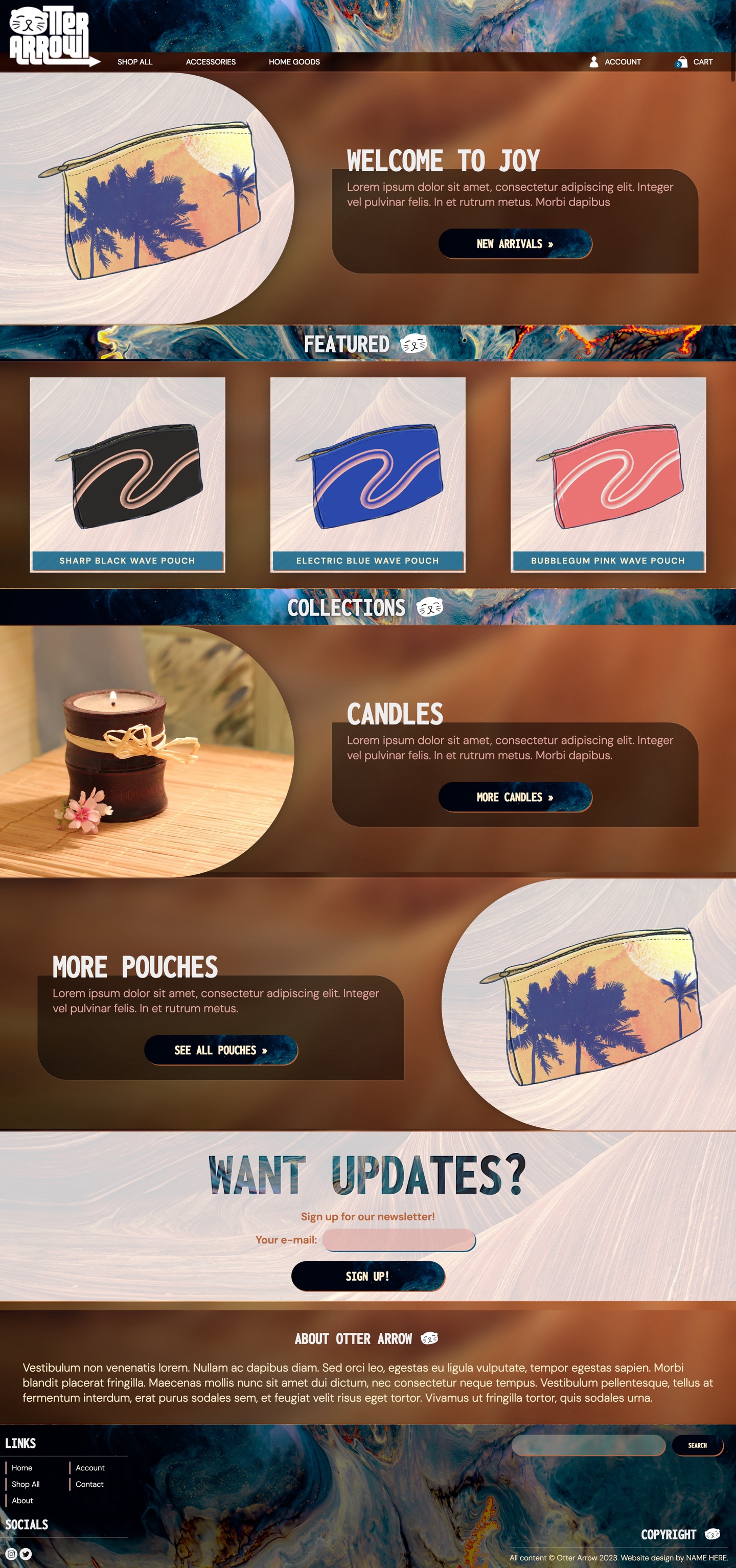
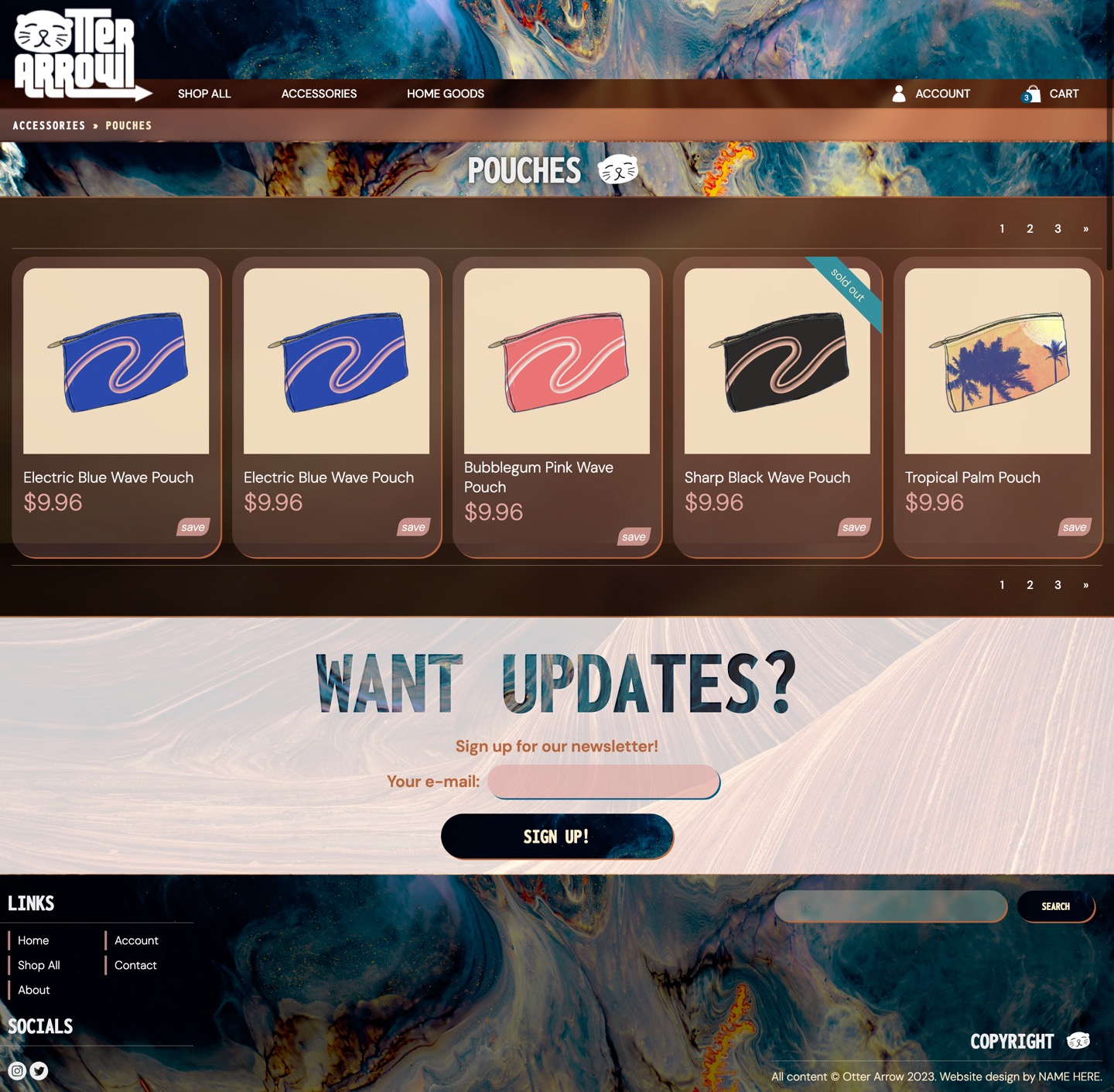
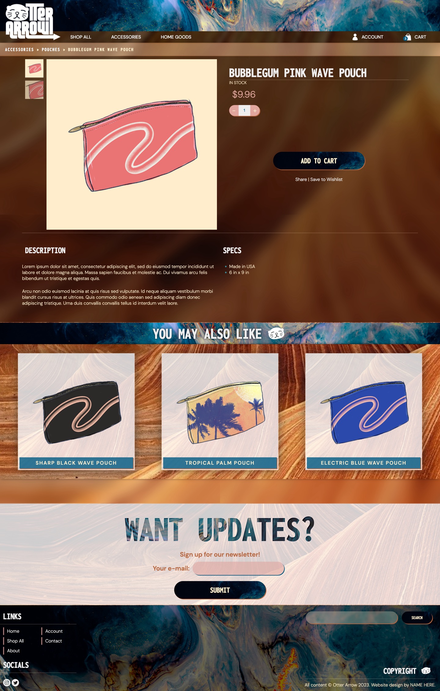
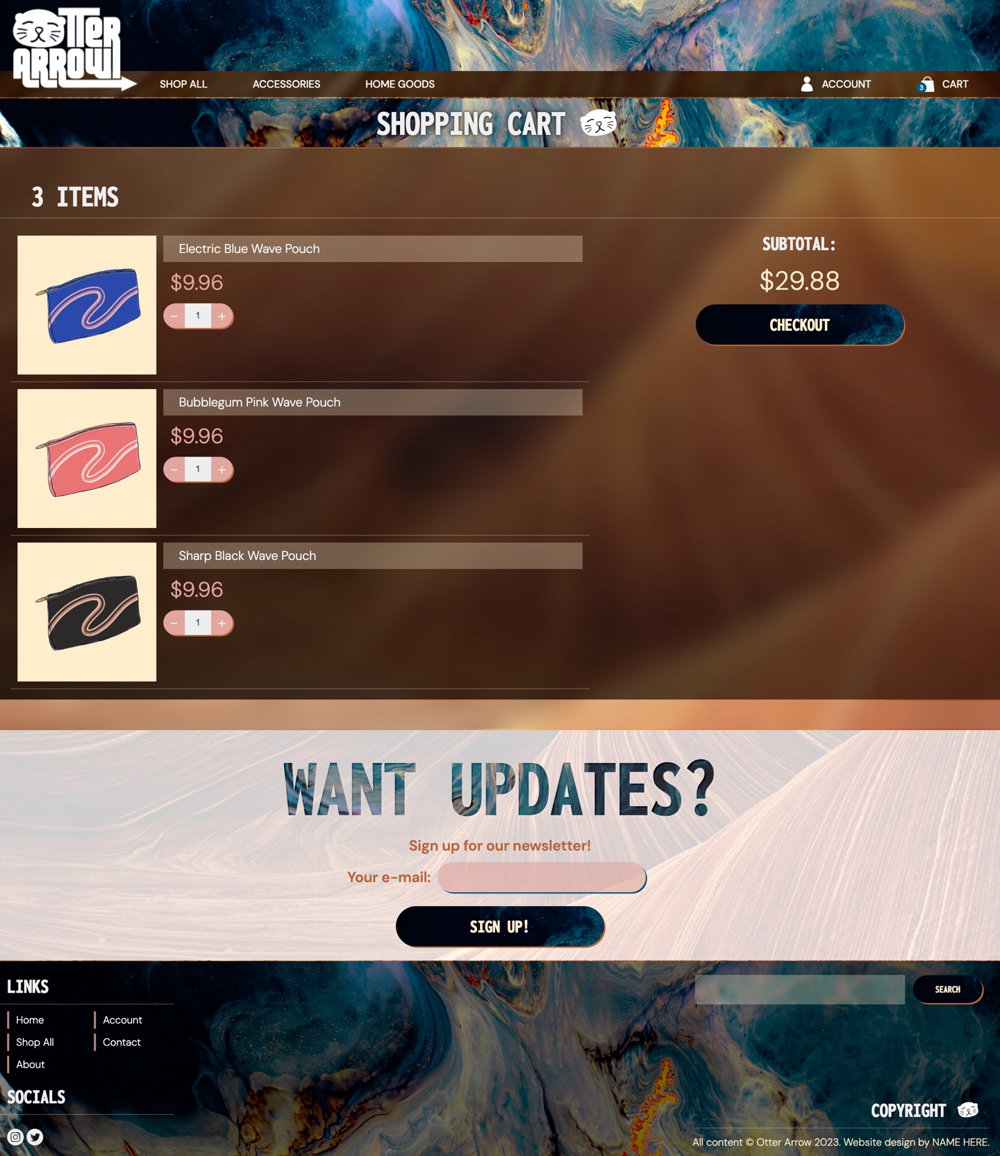
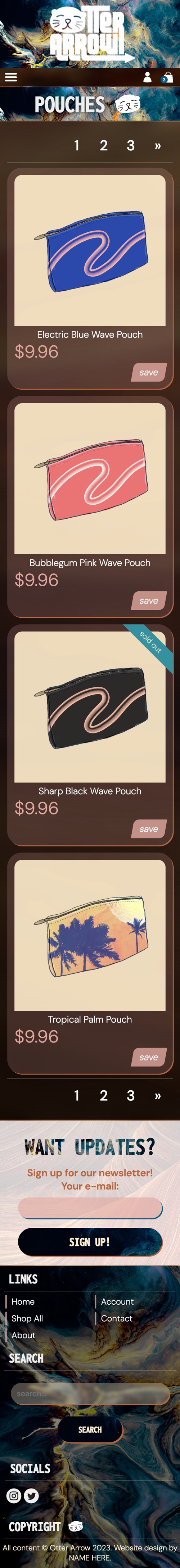
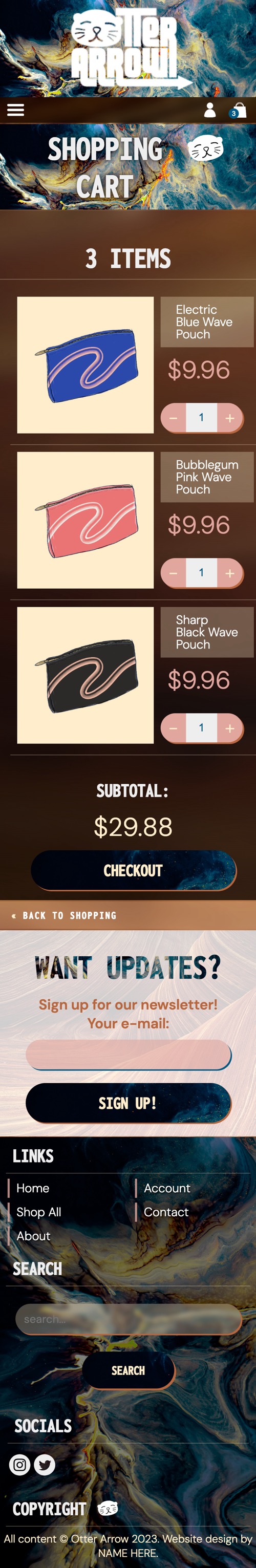
Otter Arrow
Branding & Website Creation
Otter Arrow is an new online accessories shop that required branding and website design.
First, the branding was created, including a logo, color scheme, and typography. Then the
website wireframes were created, and following that, the website was developed from
scratch . It is suitable for all devices and includes some e-commerce functionality.
Logo, Typography, Colors
Otter Arrow Logo Development StagesOtter Arrow Final Branding Assets